

Juno Music App
The Task:
Juno is the result of a semester spent learning the ins and outs of UI/UX design for a mobile prototype. It is a music streaming app that emphasizes the social aspect of music. Users are encouraged to look at how they and their friends listen to music, to share that experience, and to talk about that with each other on Juno. It was a collaborative effort with my partner that not only greatly deepened my understanding of UI/UX, but allowed me to appreciate the process of creative collaboration and designing for other human beings so much more.
Project 1
We were given the choice between creating a retail or music app. My partner and I decided on a music app. Project 1 was about laying the foundation for everything that was to come, and that meant doing lots of research.
Phase 1: User Interviews—Music App Use
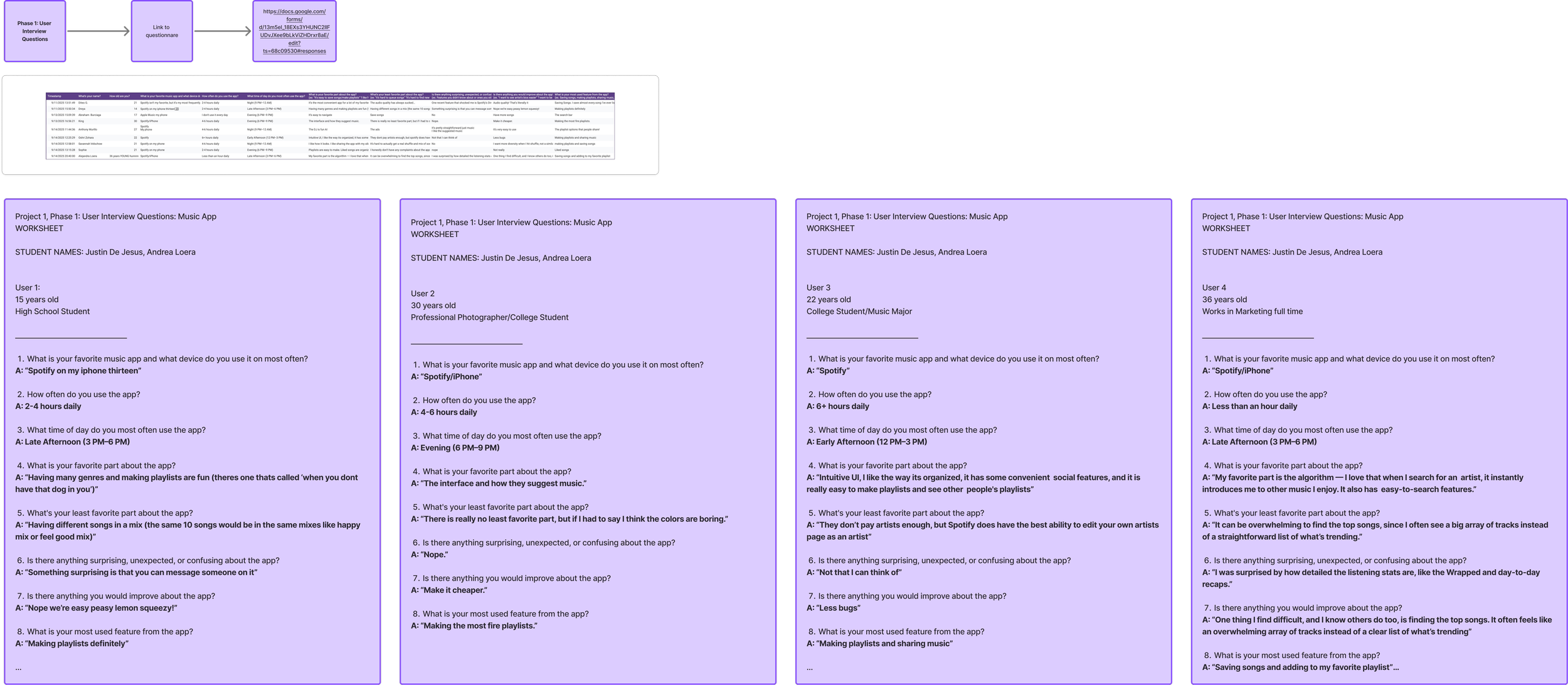
Our first step was interviewing potential users regarding what music streaming app they currently use. It was important to hit a wide age range, as to not receive age-biased data. We interviewed a 15 year old, a 22 year old, a 30 year old, and a 36 year old. We asked questions to discern what they liked and did not like about their current service. This ultimately shaped what kind of niche we wanted our app to hypothetically fill. We noted that the people we interviewed loved the process of making playlists and sharing music the most.
Phase 2: Competitive Analysis of Spotify
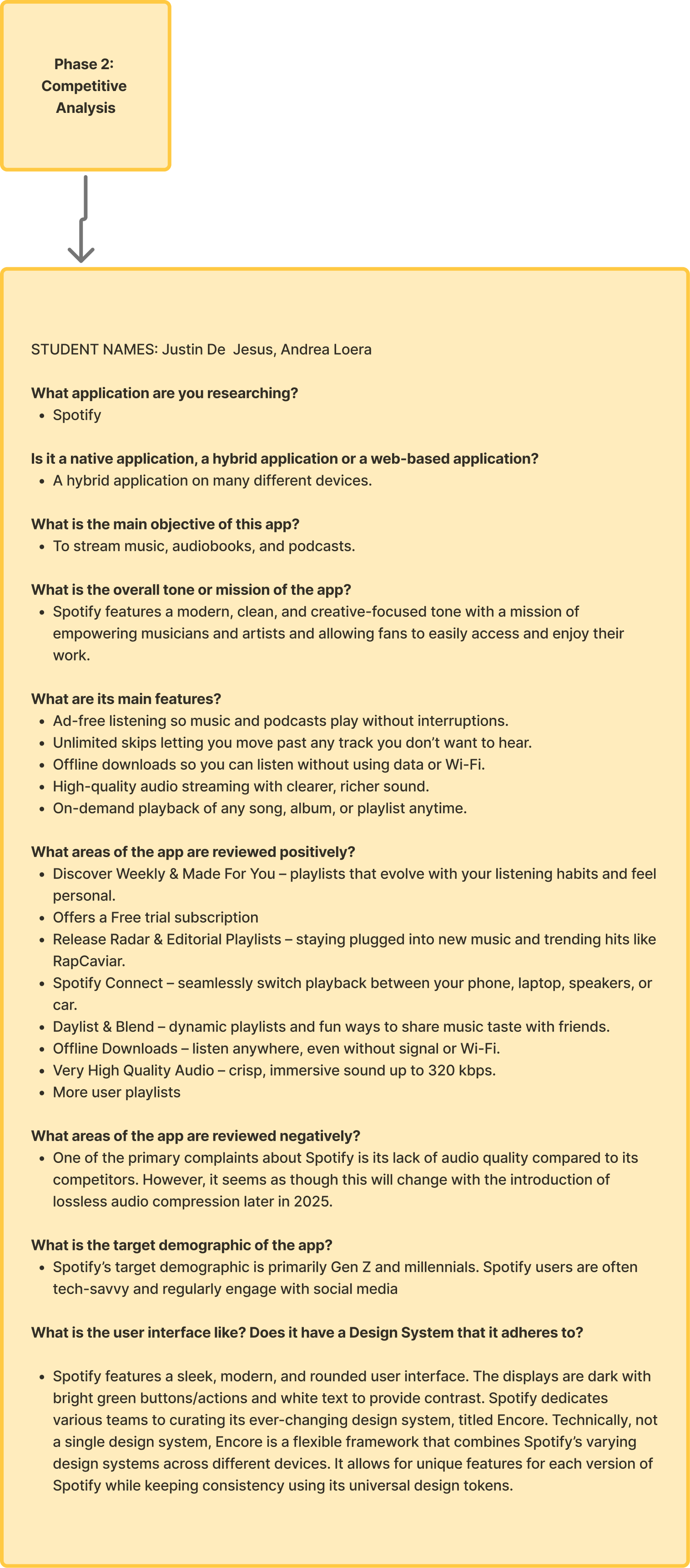
Next, we needed to take a deeper look at our competition. We chose Spotify as it is the most popular music streaming app, and was the service of choice for all of the people we interviewed. We looked into what the overall mission of Spotify is, what makes it successful, its target demographic, and what users feel could be improved.
Phase 3: Competitor User flow map
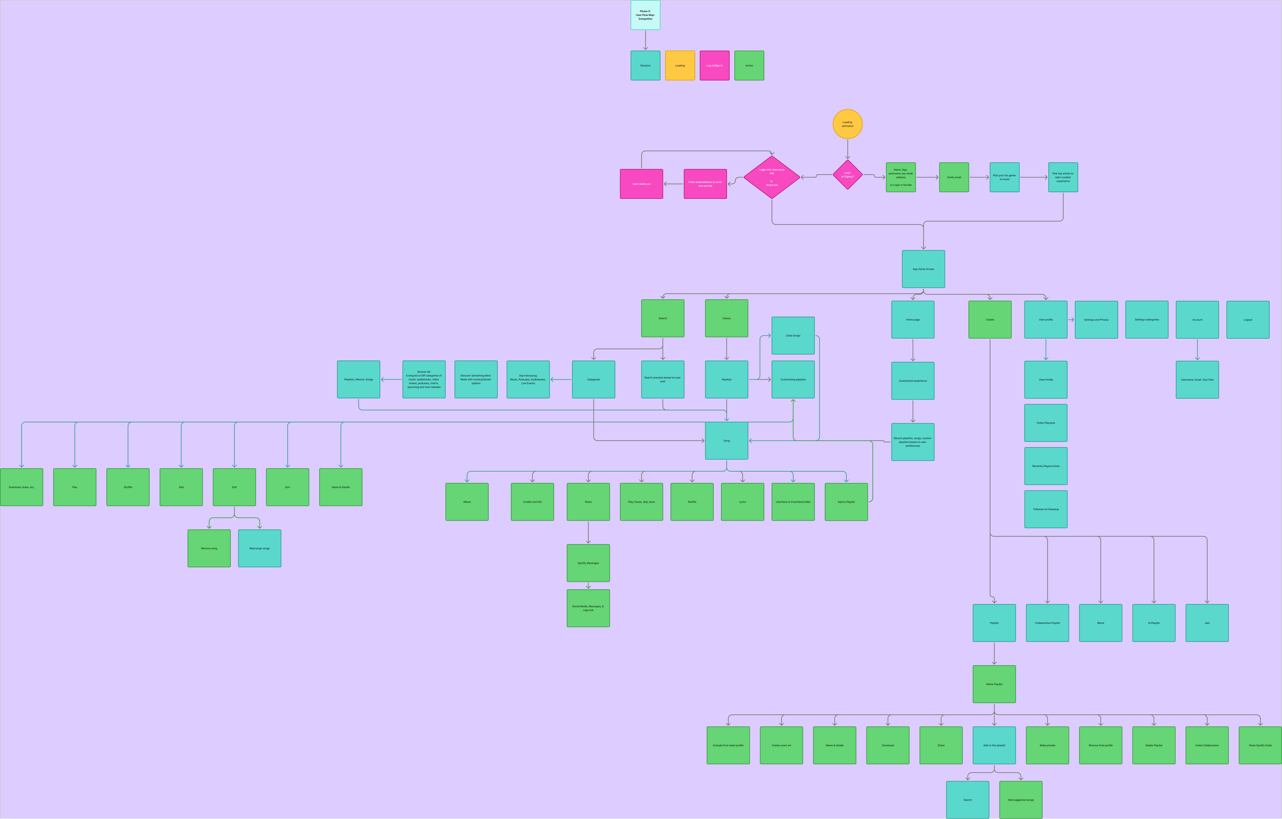
To begin to understand how to create a music app, we first needed to understand how already existing apps functioned. In order to do this, we created a user flow map of Spotify’s most used and most important user flows. This provided us with a framework to reference and ideas of where we could experiment.
Phase 4: Value Proposition
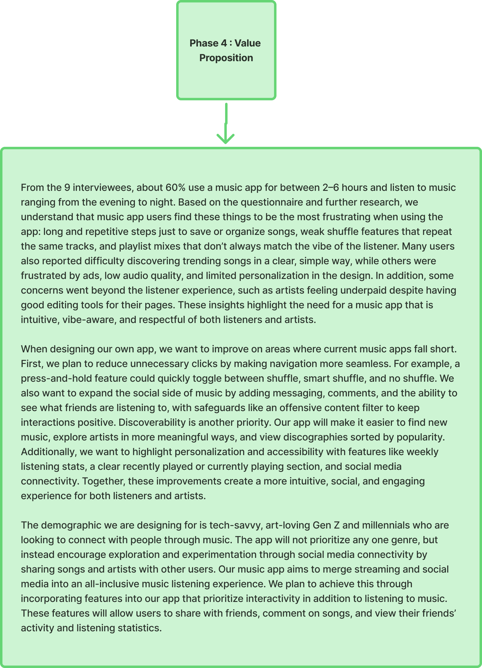
Finally, we ended Project 1 with a value proposition for our app. We needed to articulate why we were creating the app and how it would differ from the competition. Our proposal consisted of a few key points. One: many music apps do not have many social media features built in, and if they do, they are often leaving much room for improvement. Two: we do not want to prioritize a specific genre or style of music, but rather to prioritize the experience of listening to music. This would be done through promoting interactivity both with the app and with the social media features we plan to implement. Features such as messaging systems, and listening stats that are available on all user profiles.
Project 2
Project 2 was truly where the creative process began with the prototype. My partner and I created user personas based on our interviews, created a user flow for the app, and created our low fidelity wireframes based on the user flow.
Phase 1: User Personas

First, we needed to create user personas based on the data we collected from our initial interviews. Not only did the personas allow us to organize the data, but they provided us with a clearer sense of who we were designing the app for. It helped reinforce that UX design is not about designer preferences, but instead in service to as broad a user base as possible.
Phase 2: User Flow
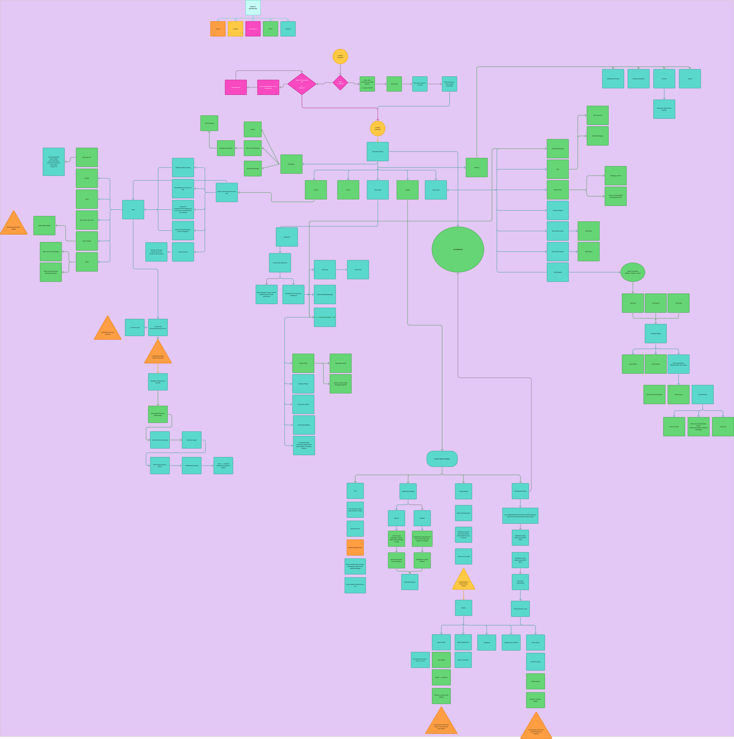
Following the personas, the next step was creating the comprehensive user flow for the app. This would serve as the true skeleton for what was to be built. We used different shapes and colors to differentiate between decisions, actions, pop ups, log-in screens, and loading screens.
Phase 3: Low Fidelity Wireframes
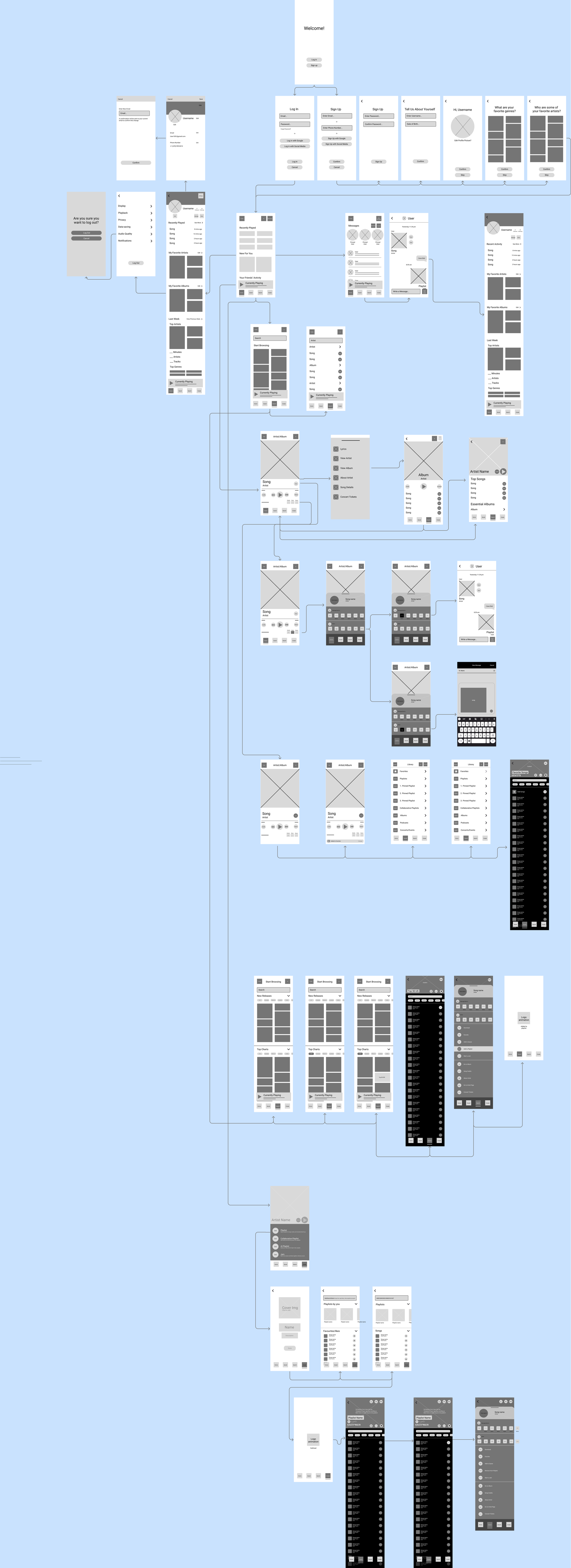
Following the user flow, the wireframing process made the app, somewhat, tangible for the first time. My partner and I equally split the load of wireframe creation, and we finally got a sense of where all of the information and components that we had planned were going to sit.
Project 3
Project 3 began the actual prototyping process. Using our low fidelity wireframes, we connected the screens using Figma’s prototyping tools. Once all of the flows we had lined out were prototyped, we did another round of user testing. From the feedback we received there, we made adjustments where necessary.
Phase 1: Low Fidelity Prototype
Although it does not look much different, if you enter the Figma file for Project 3 and open up the Prototype tab, you will see that these wireframes are very interconnected and can be clicked through.
Phase 2: User Testing—Low Fidelity Prototype
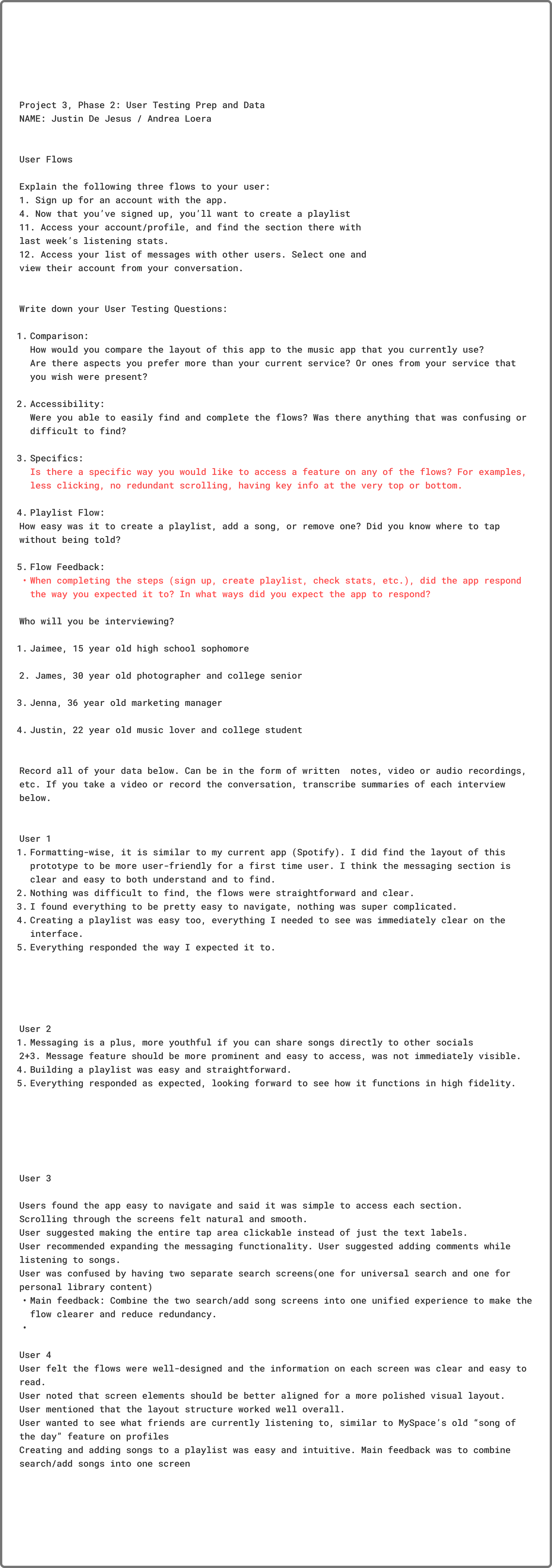
The next step was to take our low fidelity prototype and send it out to the same group of users that we interviewed in Project 1. During this round, we sat down with users and asked them to complete a set of certain flows. Afterwards we asked them five questions about their experience and jotted down the data.
Phase 3: Data Analysis
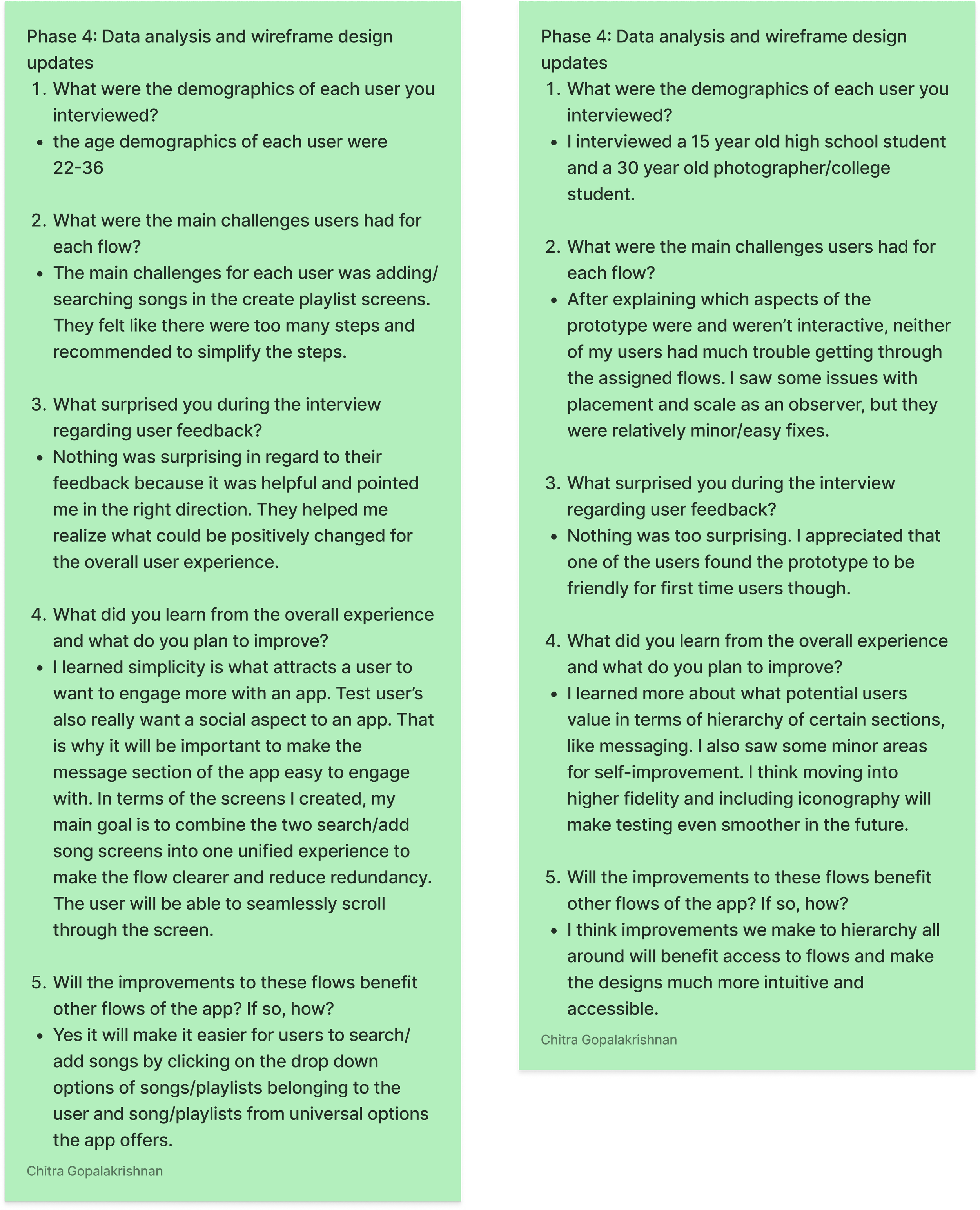
After testing, we analyzed what we learned from the second round of testing. The main takeaways, aside from learning that users would be more receptive to a high fidelity prototype, were that there were some issues with placement and scale, and that certain flows could be simplified for the ease of users.
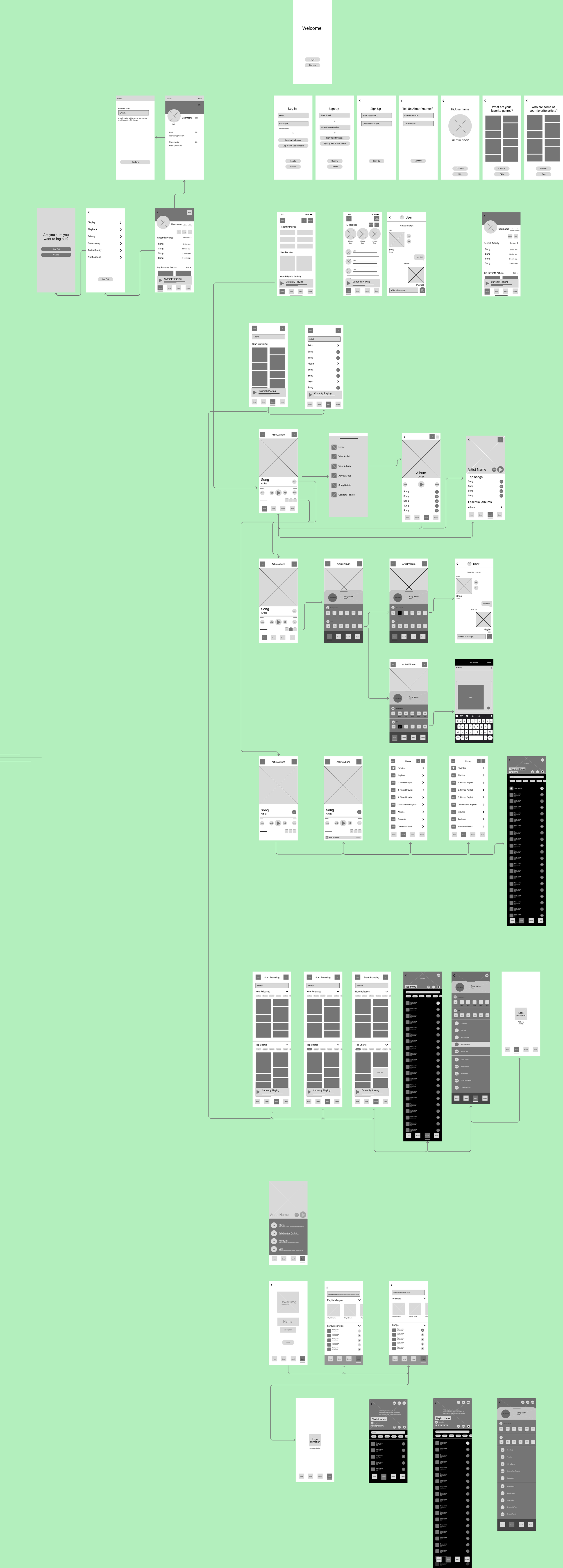
Phase 4: Wireframe Adjustments
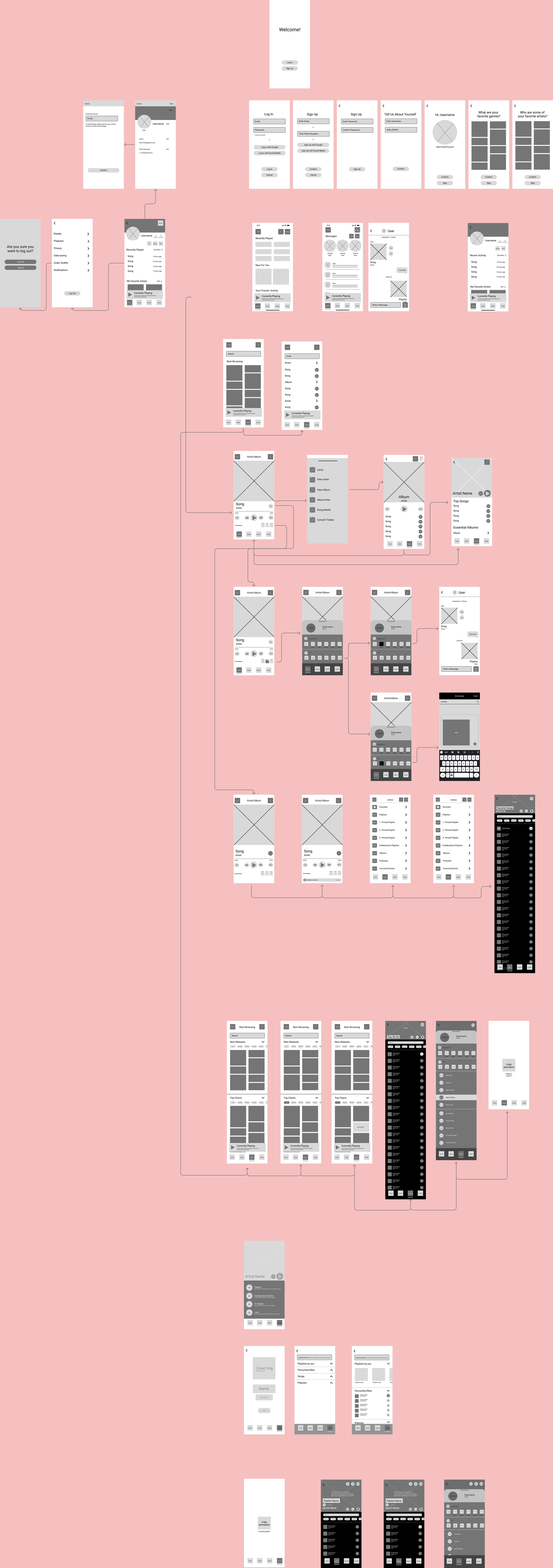
After our feedback and data analysis, a few minor changes were made to the create playlists section to improve simplicity and clarity.
Project 4
Project 4 was by far the most extensive phase of the semester, as this was where we brought the app into high fidelity. It is also where we decided on the name Juno, a friendly, versatile name that can appeal to a wide variety of audiences.
Phase 1: Moodboard & Design System
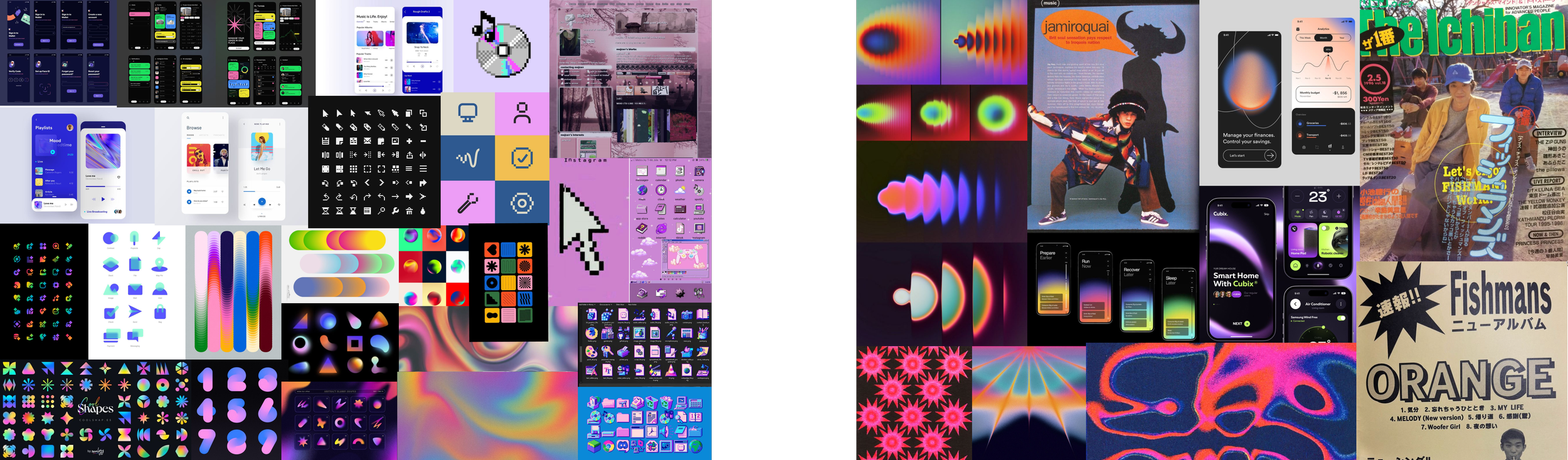
Moodboards
The first step to creating the design system was creating moodboards. My partner and I came to agreement that we wanted the identity of our app to be fun, opinionated, and colorful. We wanted to combine the aesthetics of retro bitmapped design with linear gradients to emphasize that is is an app meant to make listening to and sharing music fun.
Fonts
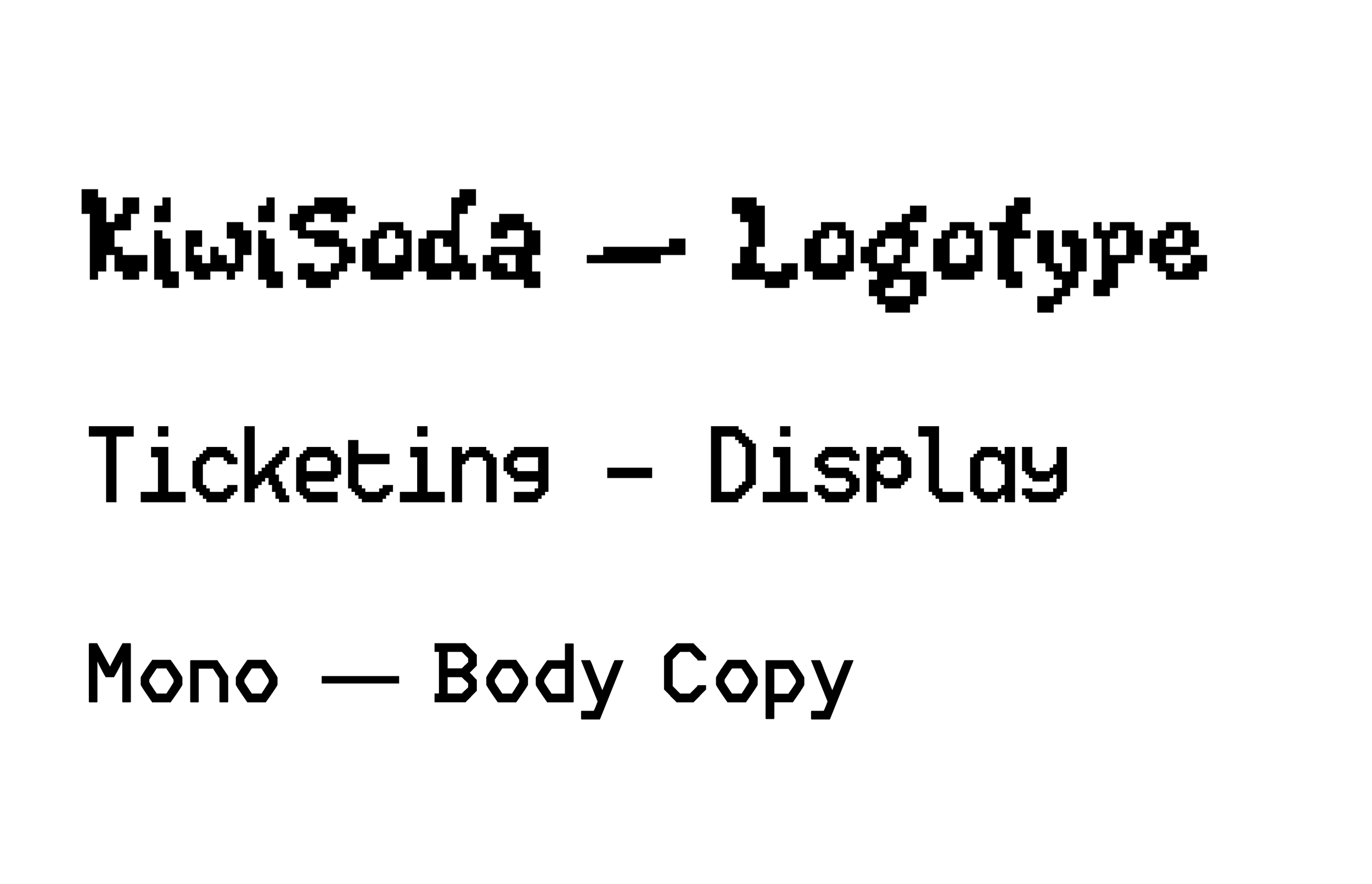
After moodboarding, we looked into dozens of pixelated fonts. Ultimately, we decided on KiwiSoda for a fun and funky logotype, Ticketing for a pixelated display/header font, and Mono for a body copy that was legible but was in line with the bitmapped system.
Color Options
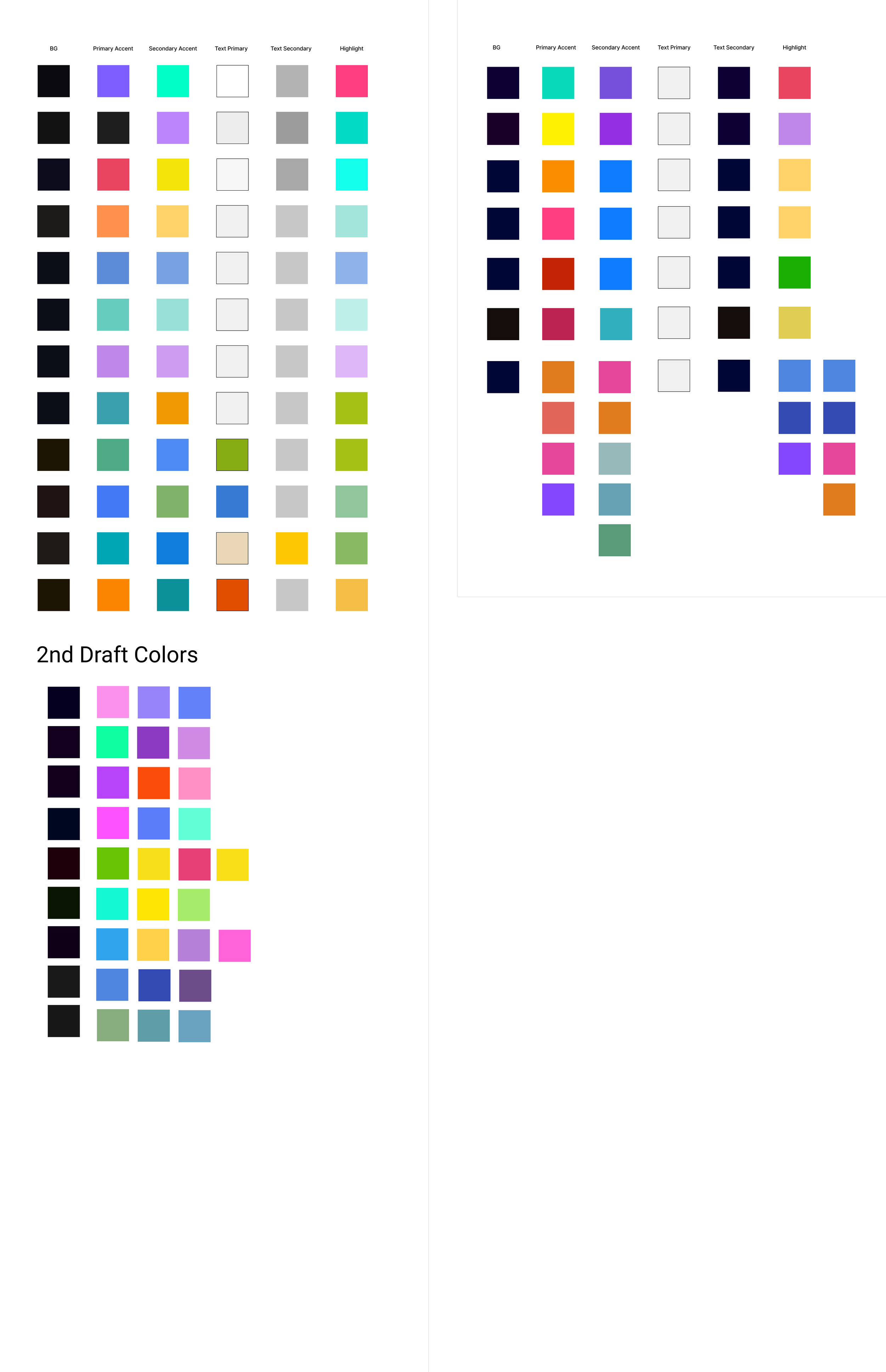
As previously mentioned, we wanted to include colorful linear gradients throughout the app. We did not want to stick to just one color scheme, but rather, a wide variety of colors that would change dependent on the screen, making the presence of random color a feature of the app itself. Were the app fully functional, we would have had randomly generated gradients be part of many of the screens.
Phase 2: High Fidelity Prototype Draft 1

Putting everything together from the design system, we created 43 unique screens for the high fidelity prototype.
Icon Sets
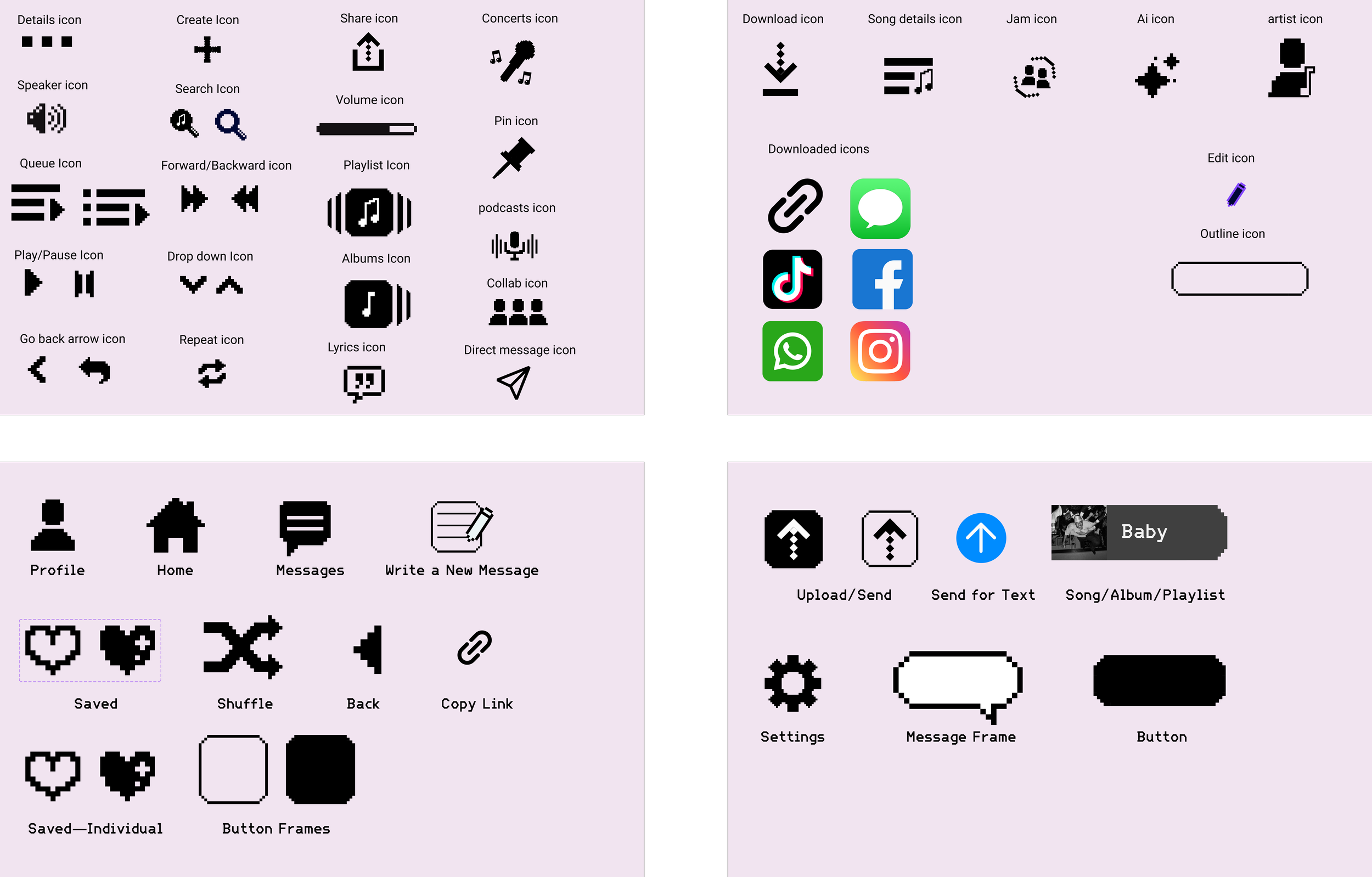
Keeping in line with our bitmapped theme, we wanted as many of our icons as possible to be pixelated.
Component Sets
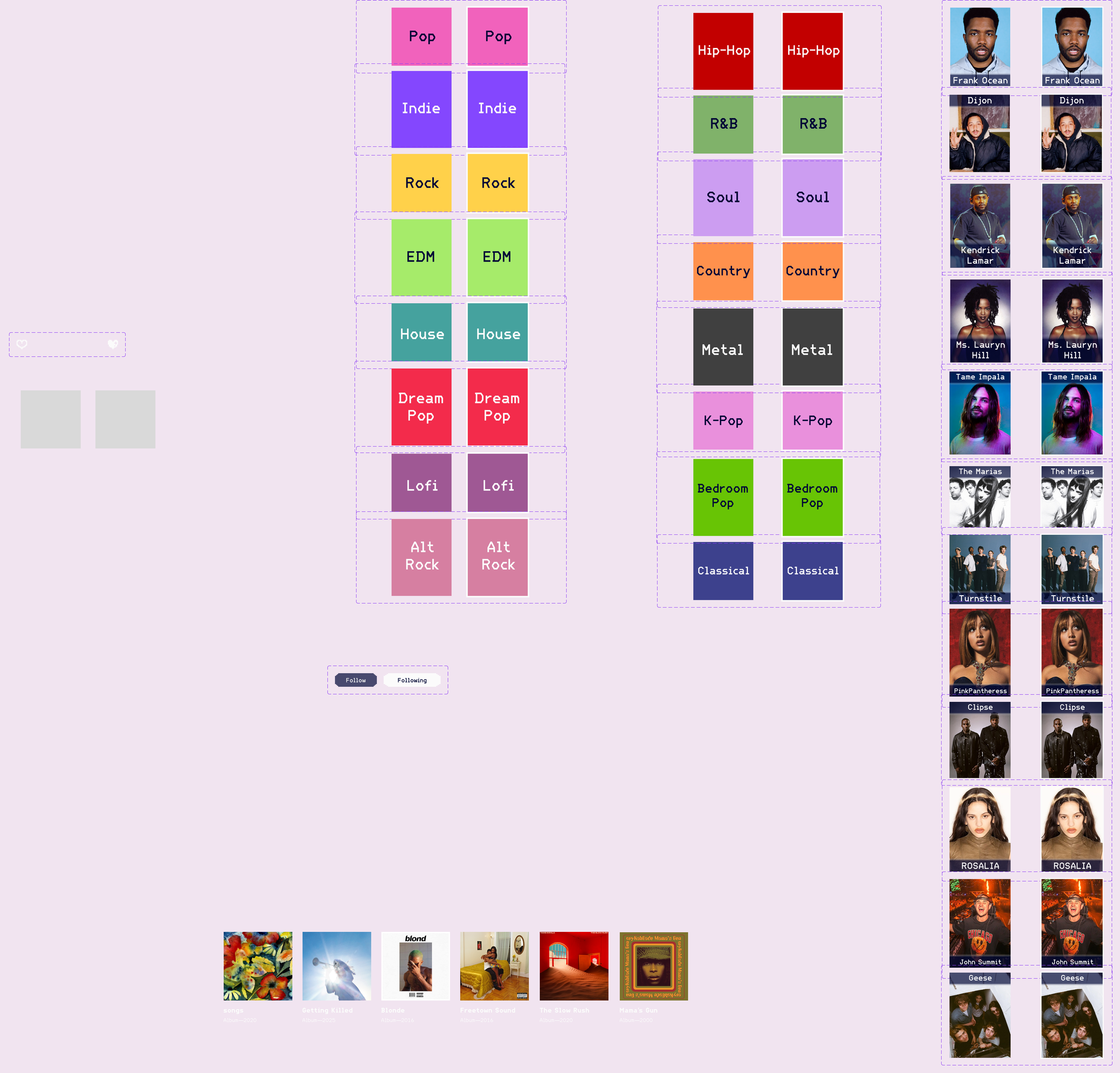
While not all, here are some of the component sets we used in the creation of the prototype.
Project 5
Finally, the last step of the process was to go through one more round of testing for the high fidelity prototype. We had some initial bugs with our first draft, but aside from those, our participants gave us some great and meaningful feedback on dialing back a bit of the visual excess and making the overall experience simpler. I take it as a good sign that many of the participants wished that the app was real.
Phase 1: User Testing—High Fidelity Prototype
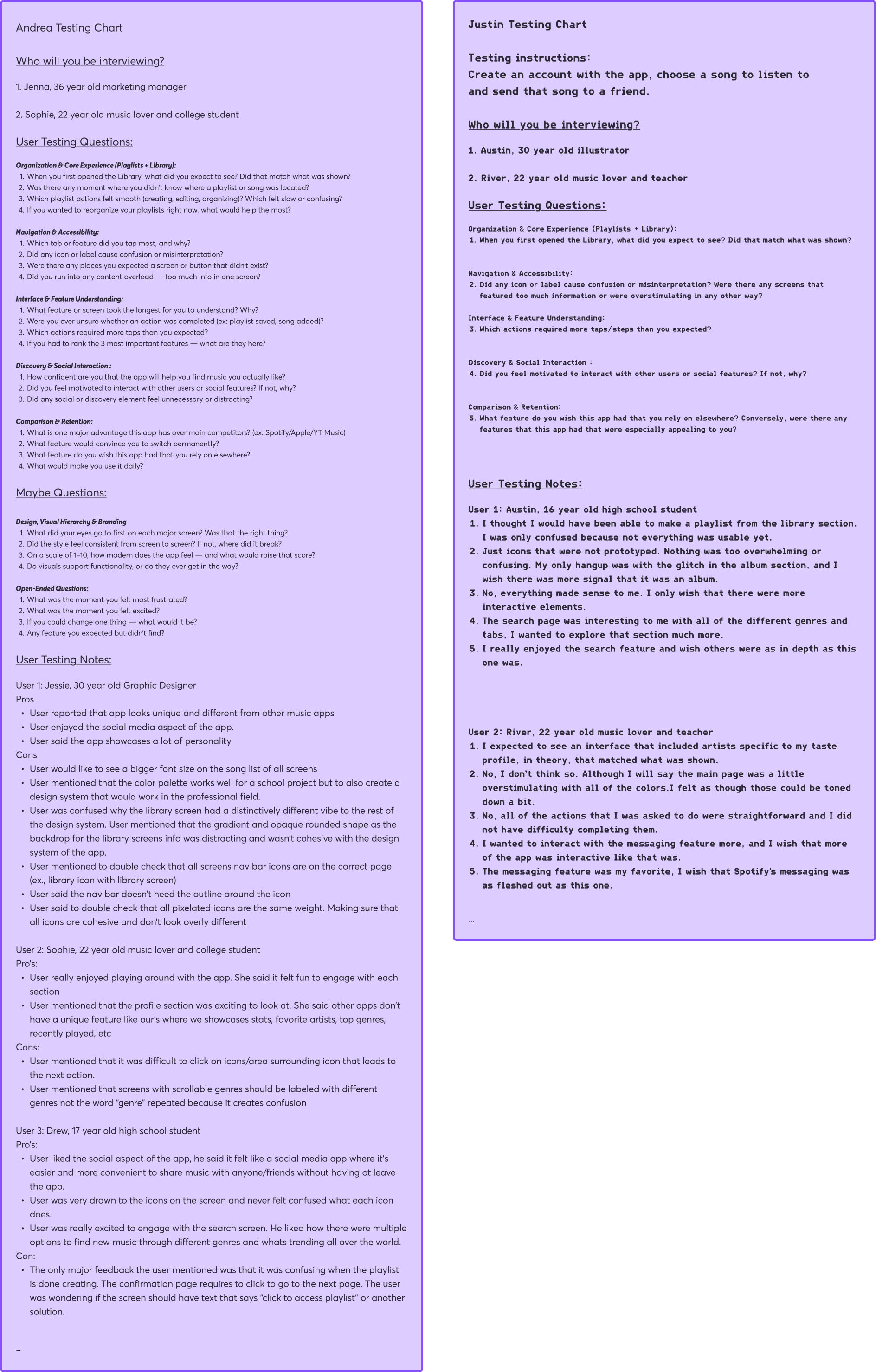
My partner and I tested on a few new individuals this time around, though we made sure that these people were within the same age bracket as the previous participants. We asked questions that clarified whether or not anything, visually or functionally, in the prototype was confusing, as well as if there were any hangups completing the required flows.
Phase 2: User Testing Analysis
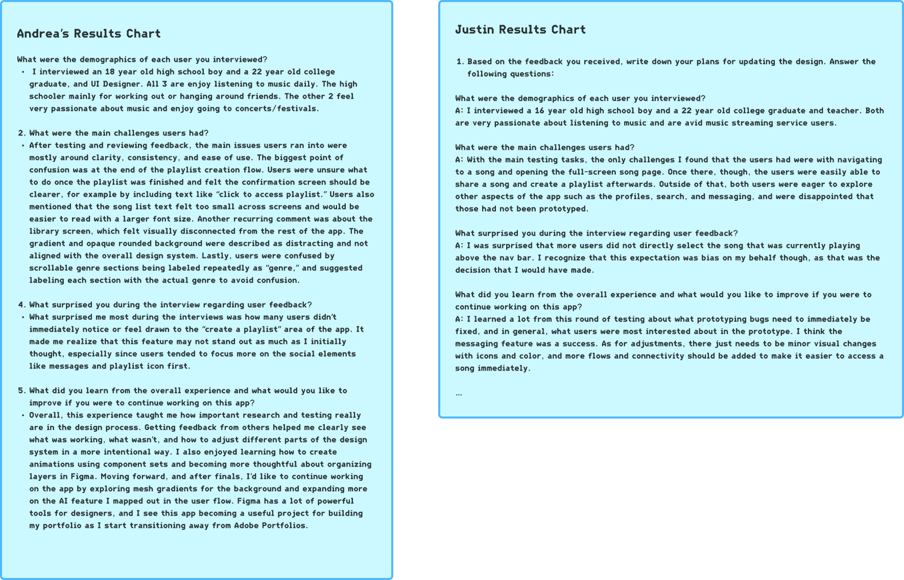
Our testing results found that users were able to, for the most part, easily complete the required flows. The primary hangups we found were in not being able to immediately access a song in multiple different ways, and needing more confirmation that a playlist was created.
Phase 3: Final prototype Revisions
For the final step of this semester long project, we made adjustments to our prototype based on all of the feedback that we received in our final round of testing. Annotations were made next to the changes.
It was a long process full of its fair share of frustrations and learning curves, but I find that it was invaluable to my growth as a designer. Outside of the numerous technical skills I gained, I gained immense experience in collaboration, communication, and listening and designing for other human beings.