

Data Selfies
The Task:
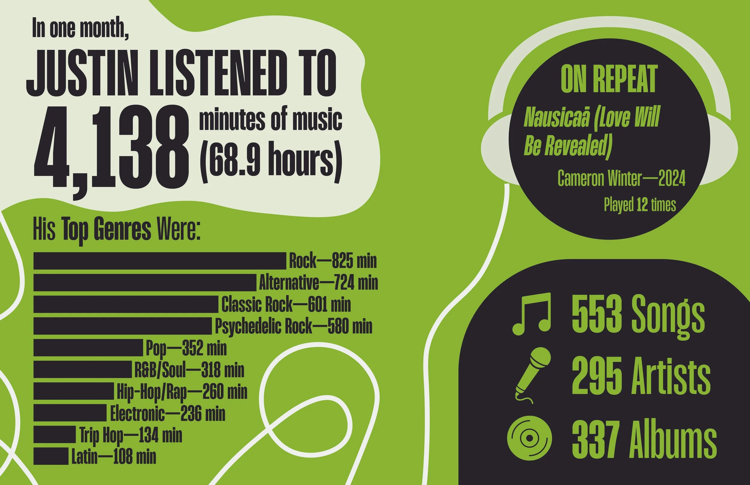
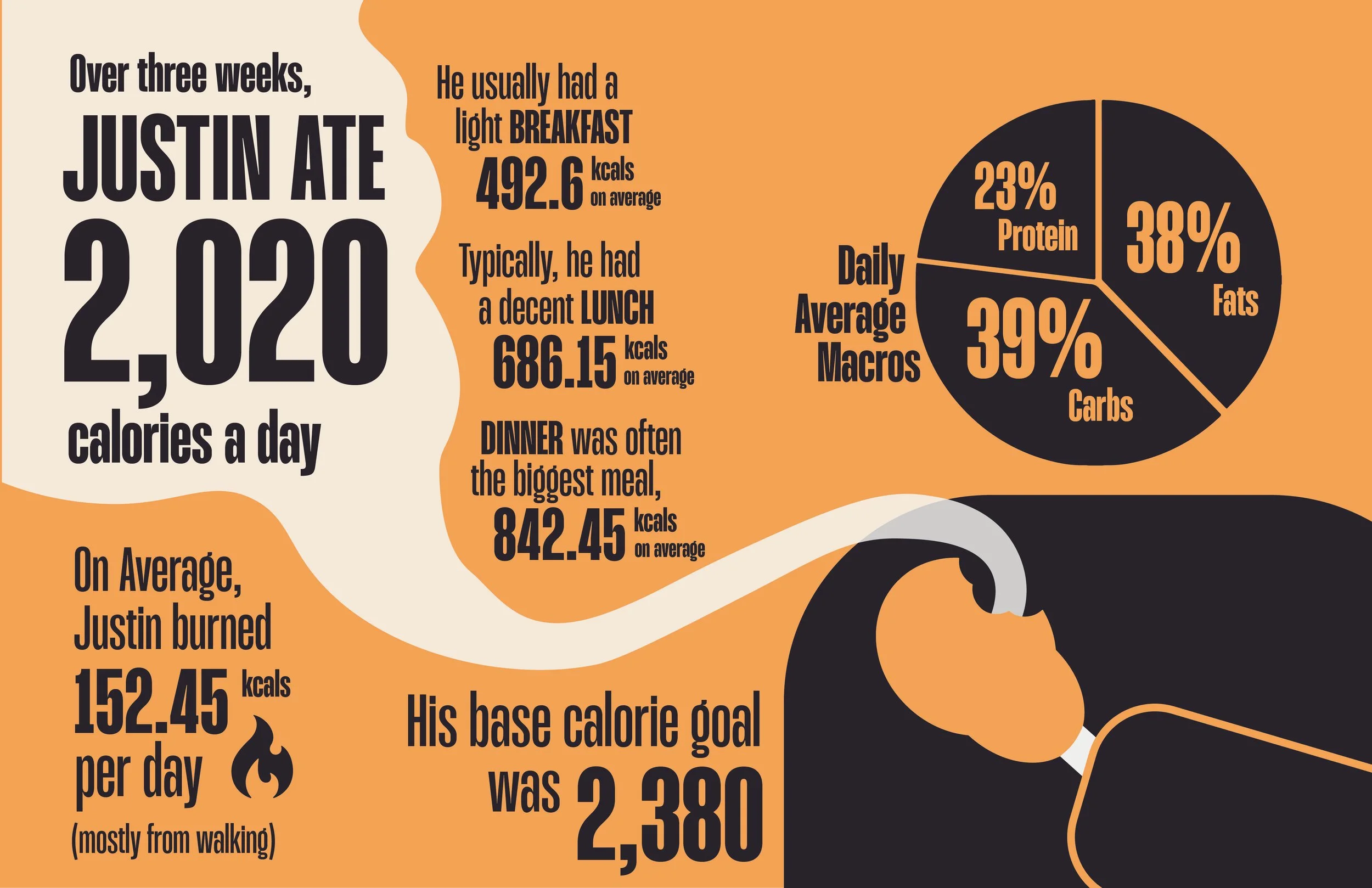
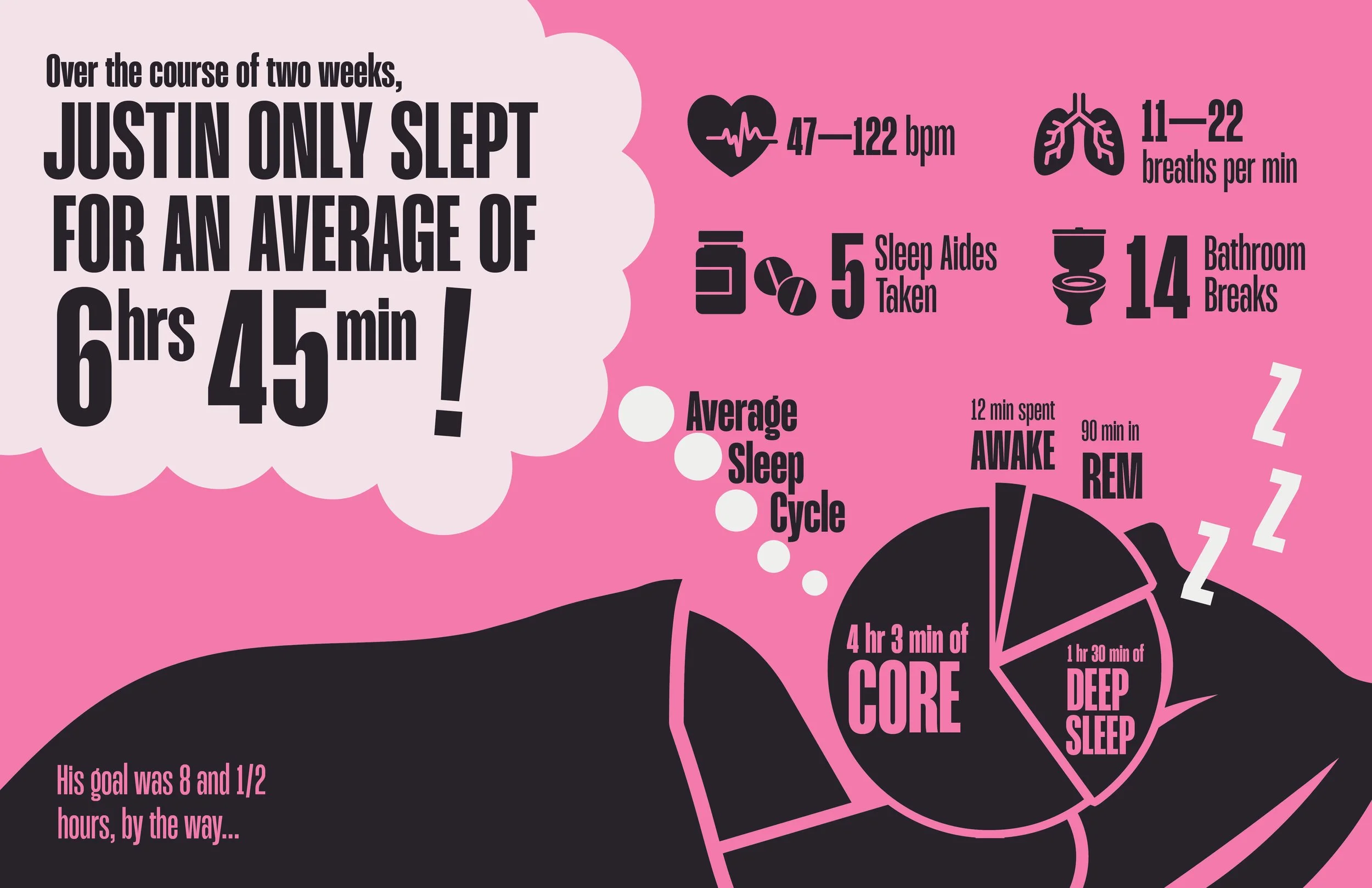
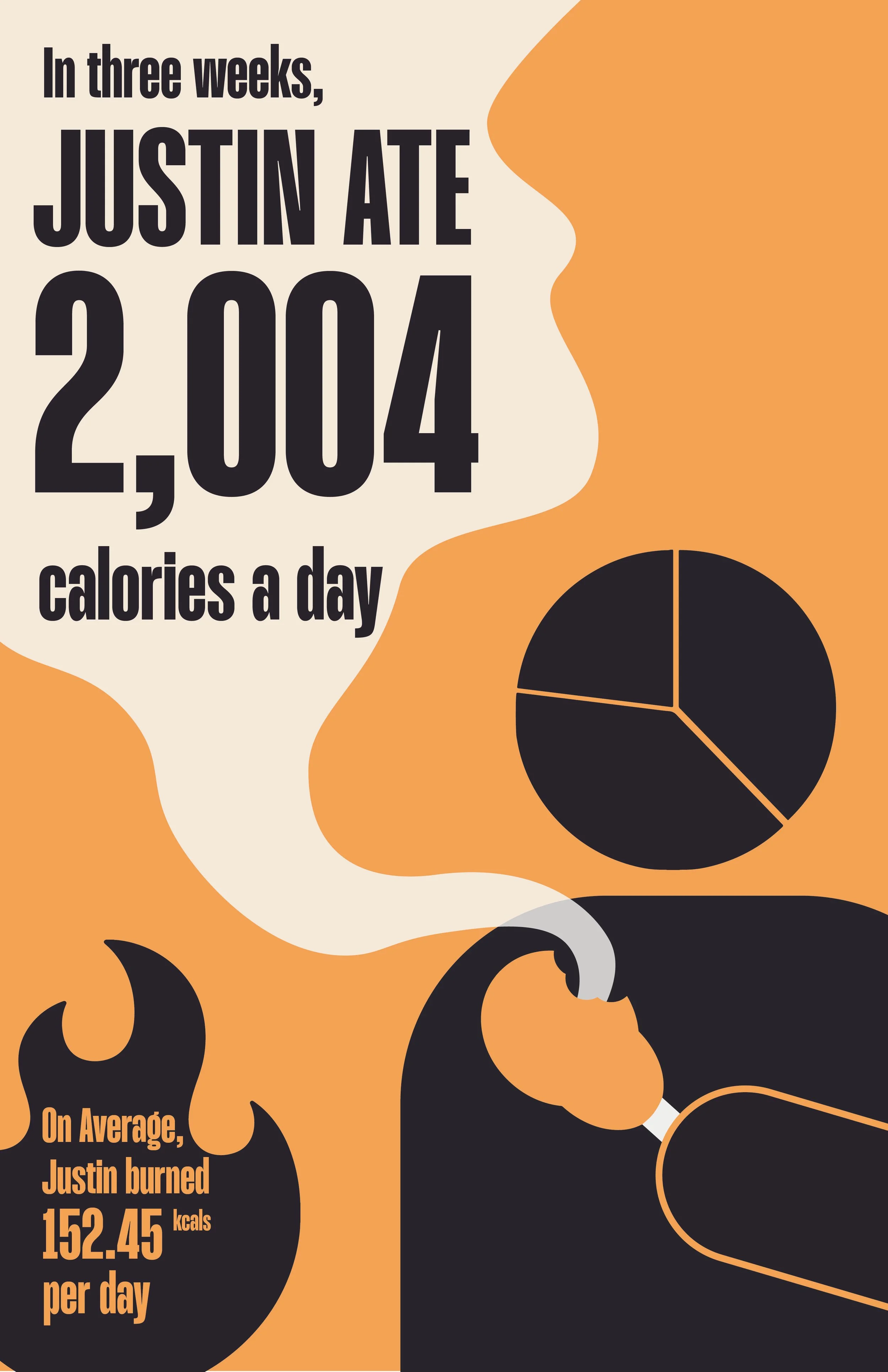
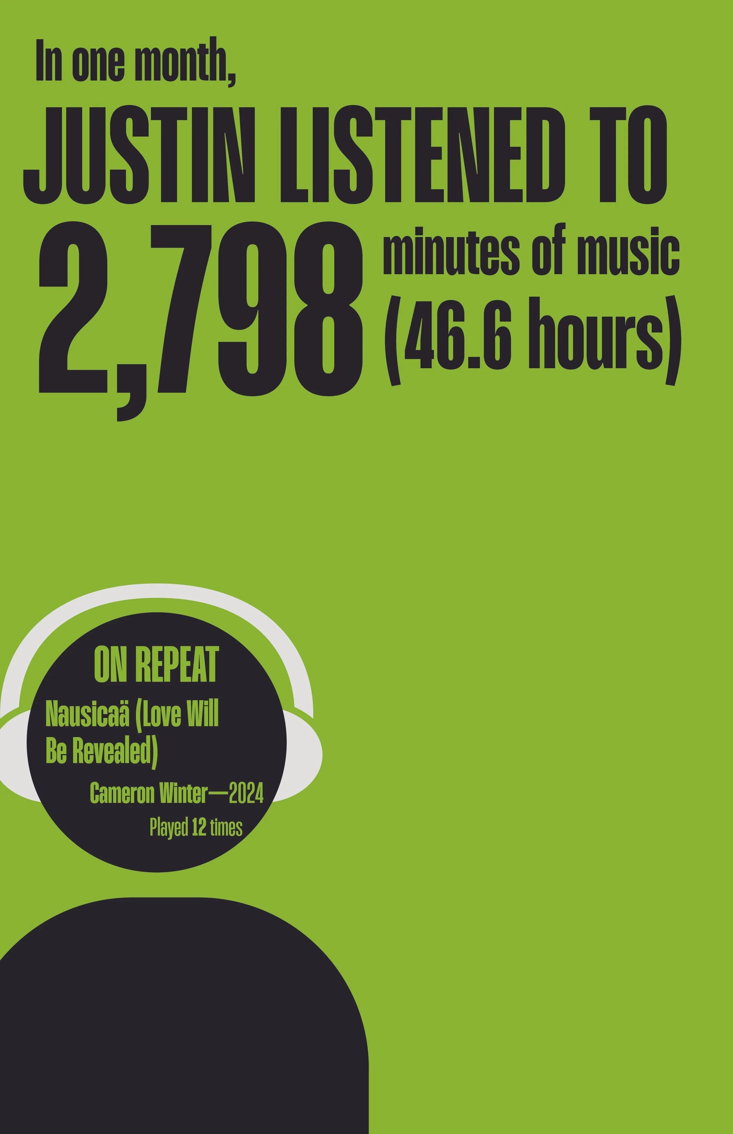
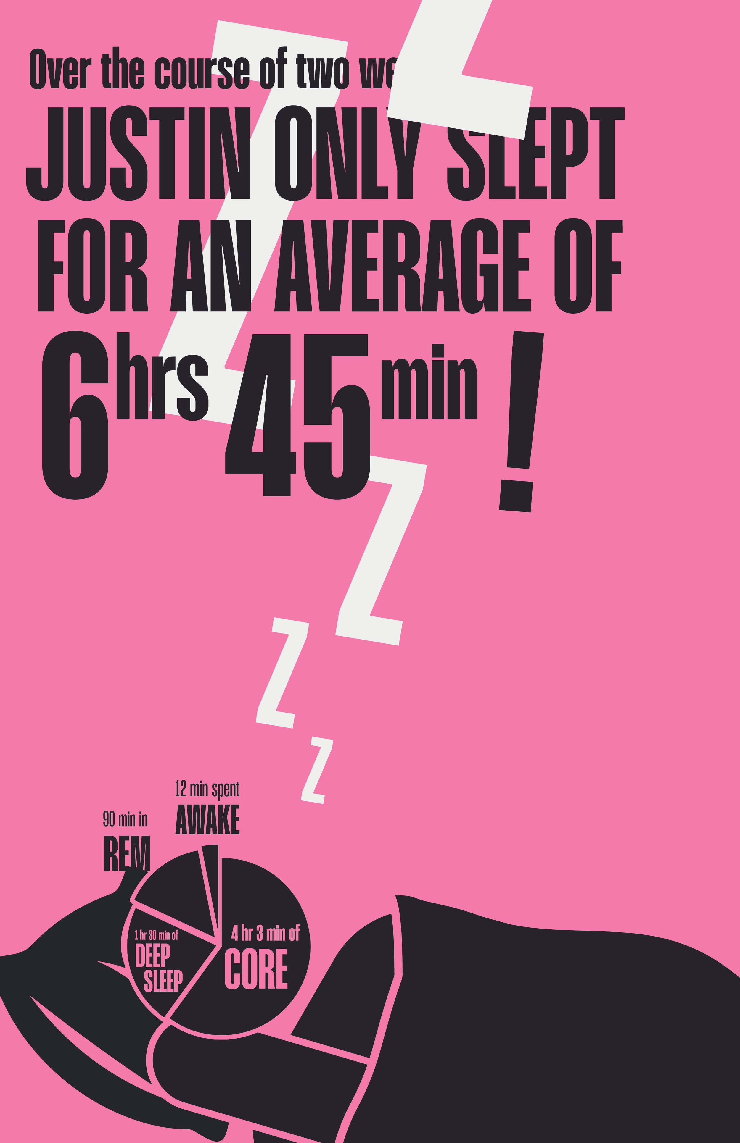
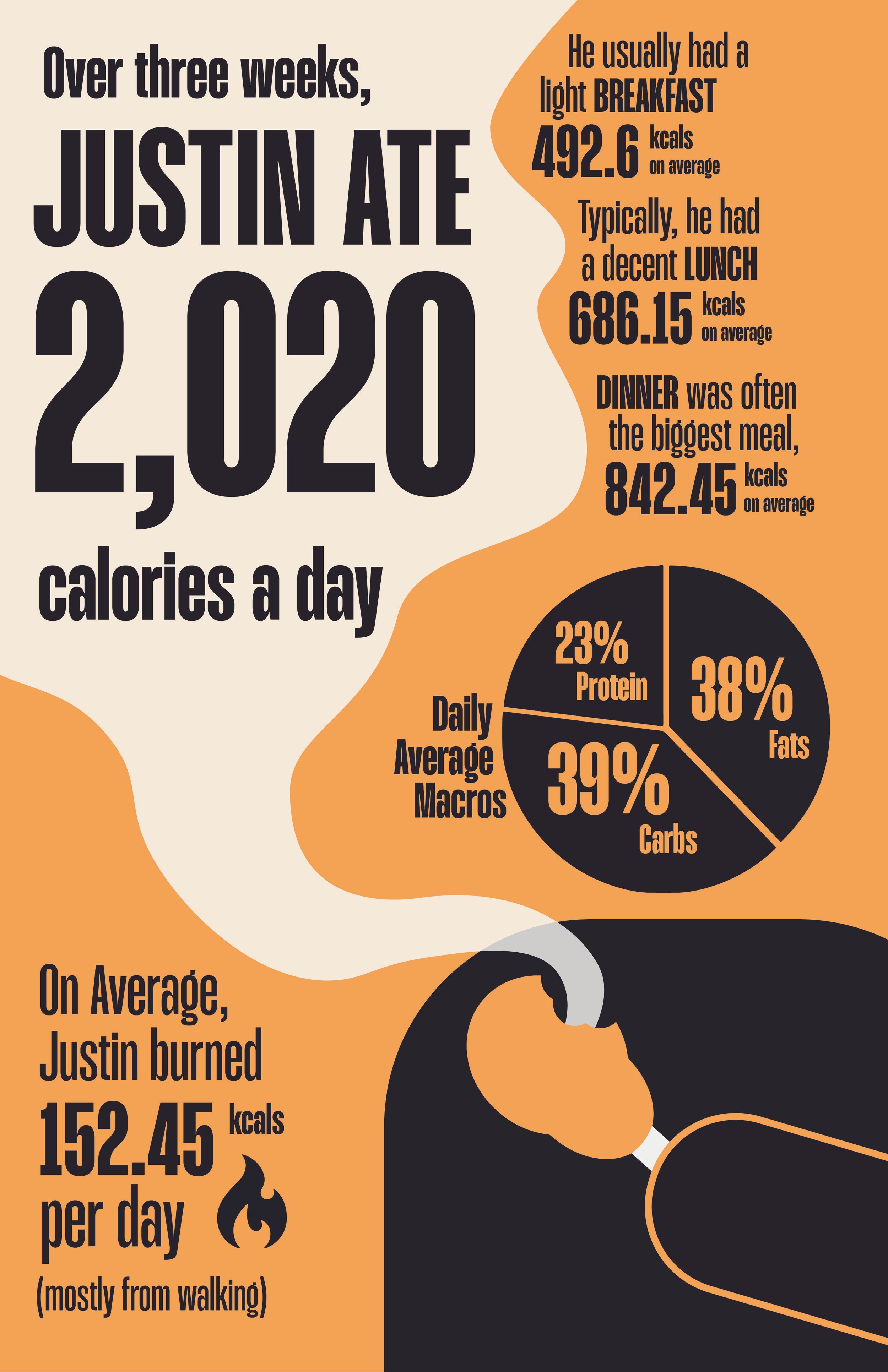
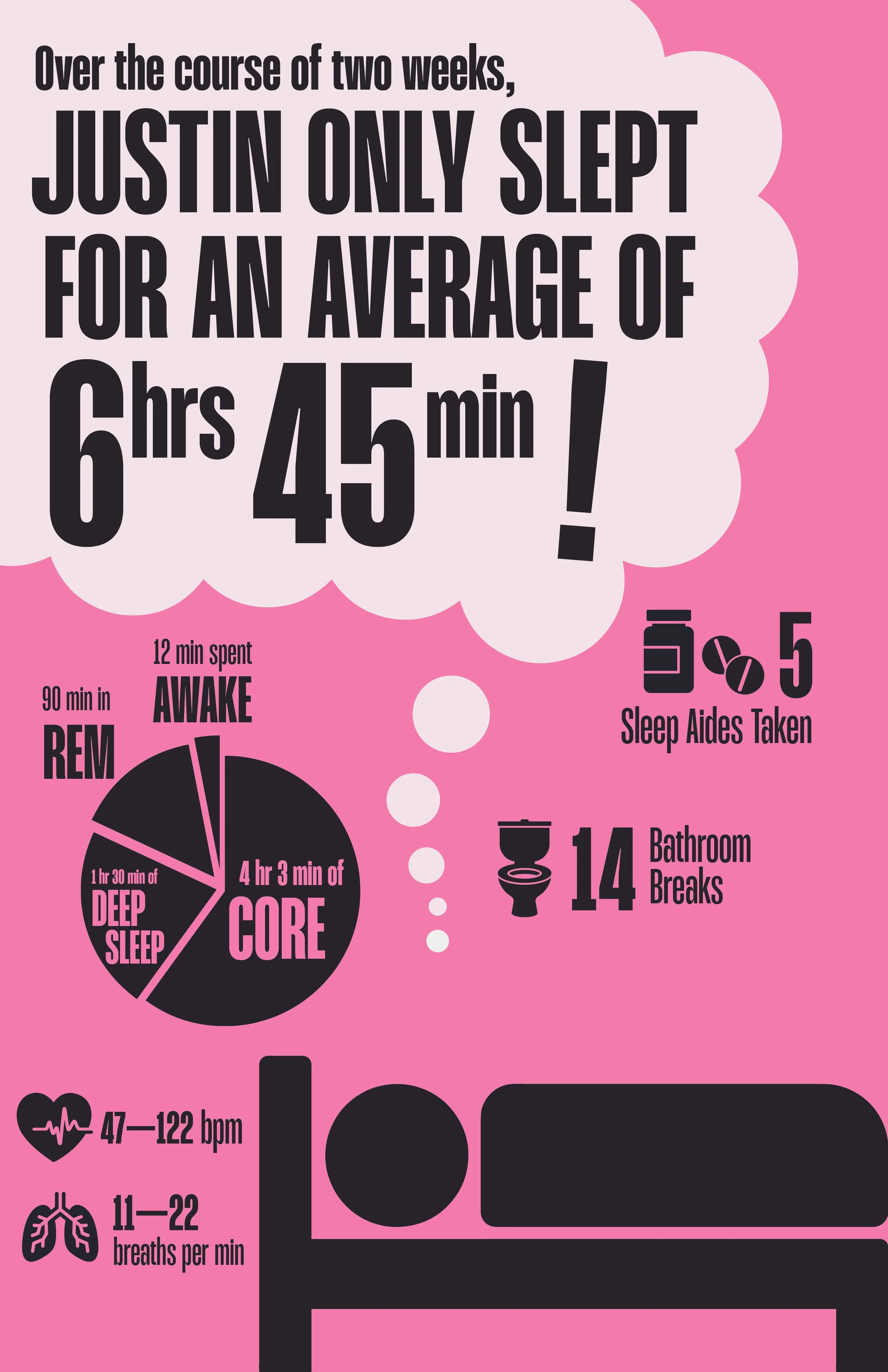
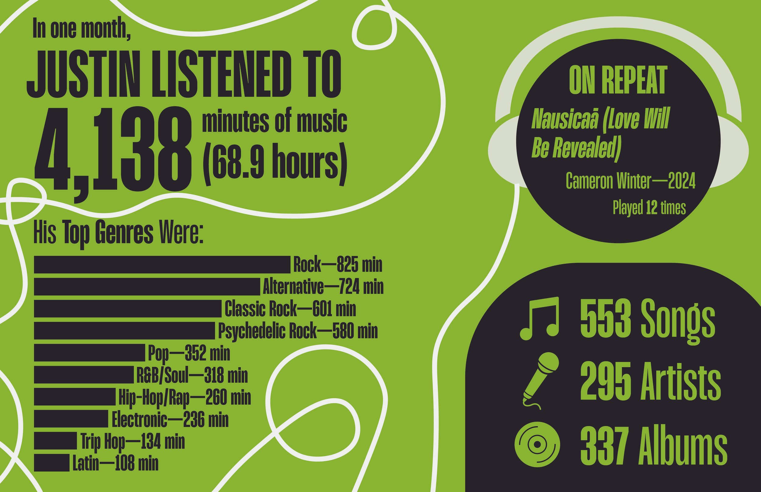
Here, I was tasked with working with infographics in a new way: data from my personal life. The premise of a “data selfie” is that it is a visual representation of statistics from a person’s life in the form of a poster. With this project, I was asked to do three. Besides translating data into a visually-cohesive and digestible format, I found that this process gave me a new insight into how my habits looked and how my routine worked from an outside perspective, and it was fascinating.
Inspiration & Initial Type Considerations

To pair with this visual system, I first wanted legibility, especially from a distance. However, I also wanted to have typography that did not overshadow the imagery, but had a presence in its own right. In my explorations I looked at a few different kinds of legible sans serifs that ranged from the clean symmetry of Helvetica to the quirky soft edges of Kalmansk.
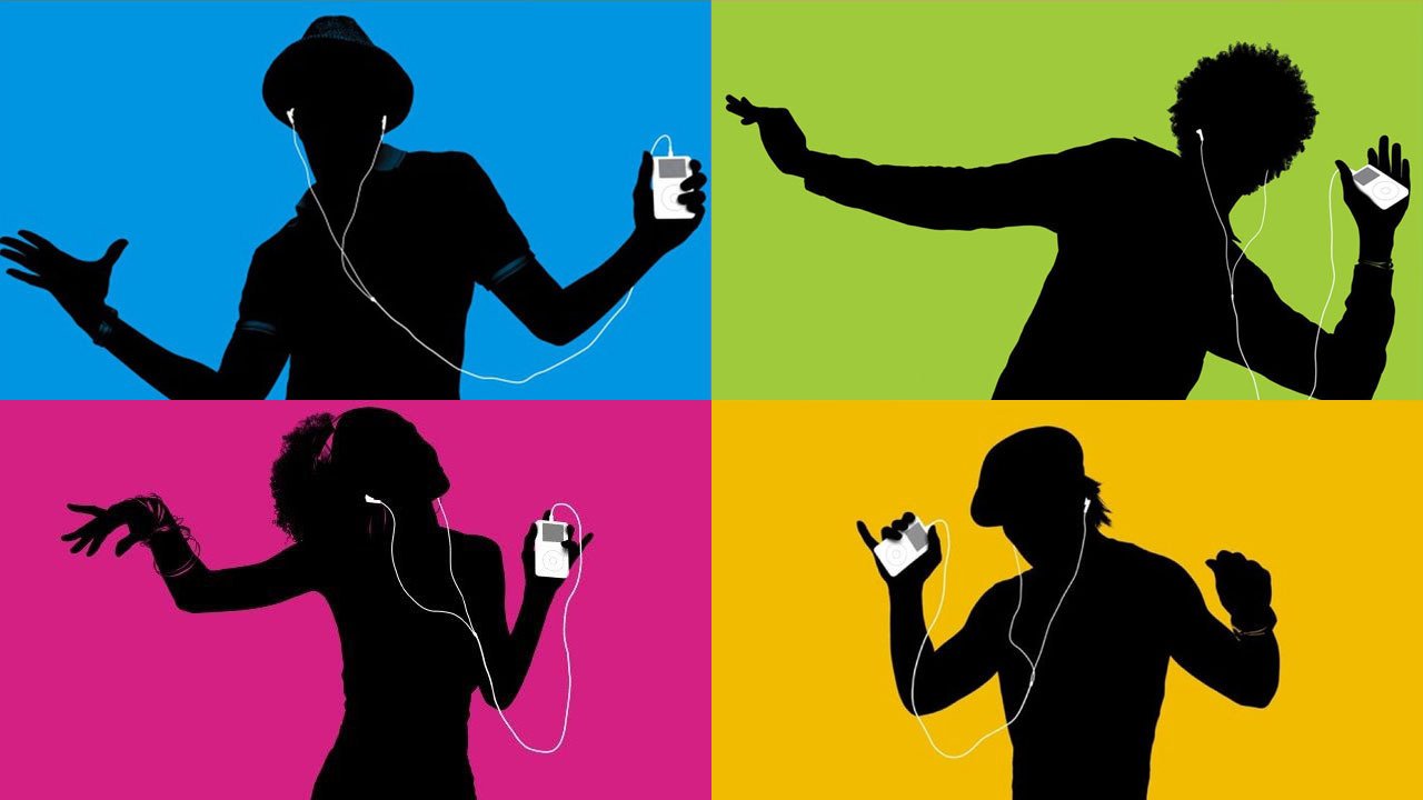
While brainstorming, I was thinking of ways that I could easily draw the viewer in to the composition, and my first thought was high contrast. An incredibly successful example of high contrast imagery that stuck out in my mind was the silhouette campaign that Apple did for the release of the iPod. The black silhouette worked so well against the bright, saturated backgrounds, and the white highlight of the iPod was the cherry on top. I wanted to use a similar high contrast method in my work.
Drafts
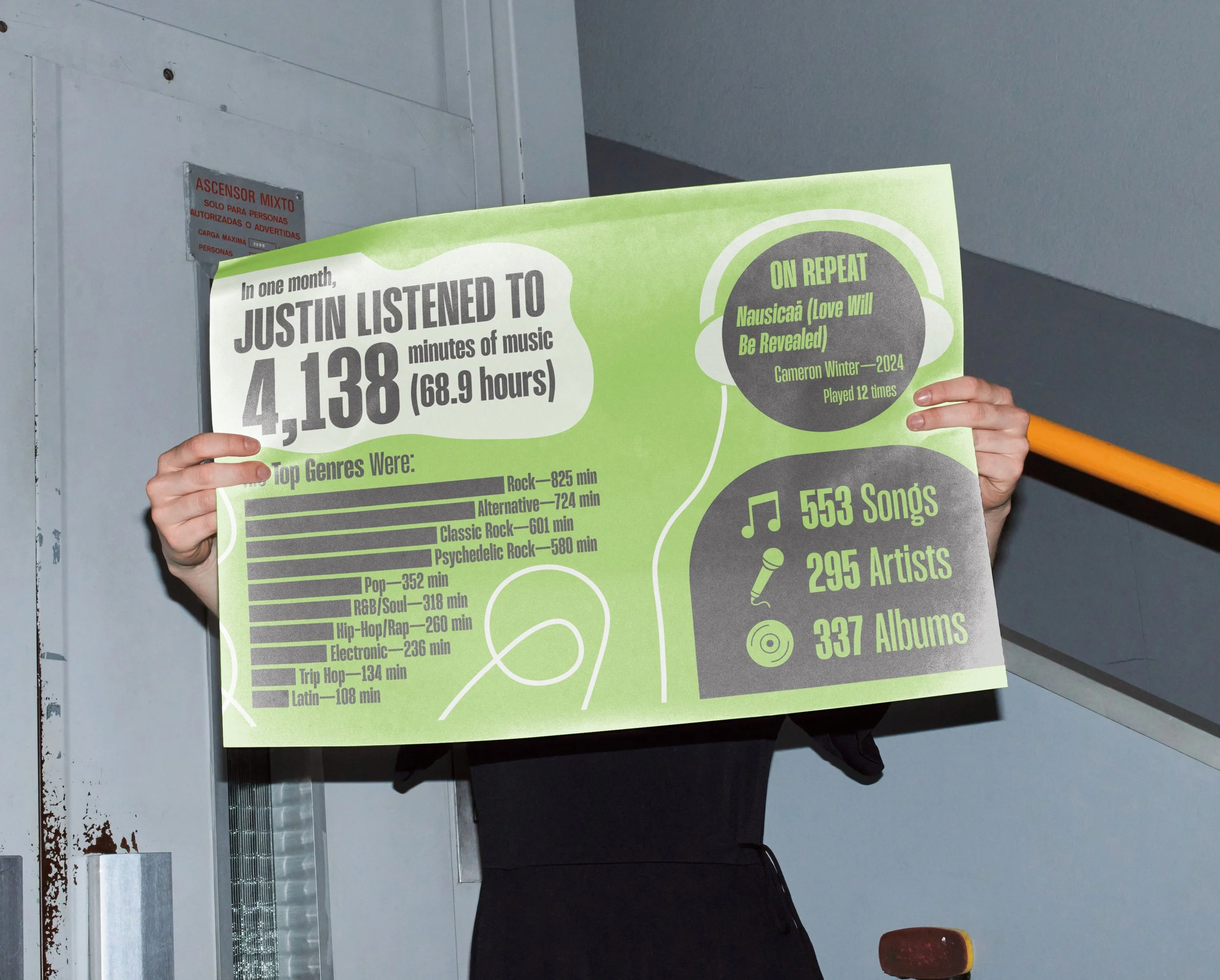
With the icons, I wanted to simplify the characters and images down so that they could still stand as focal points without having so much detail get in the way of the legibility of the information. At first, I was dead-set on having these posters be vertical, but ultimately, I found that the horizontal compositions felt the most cohesive and complete.
Font & Color Palette
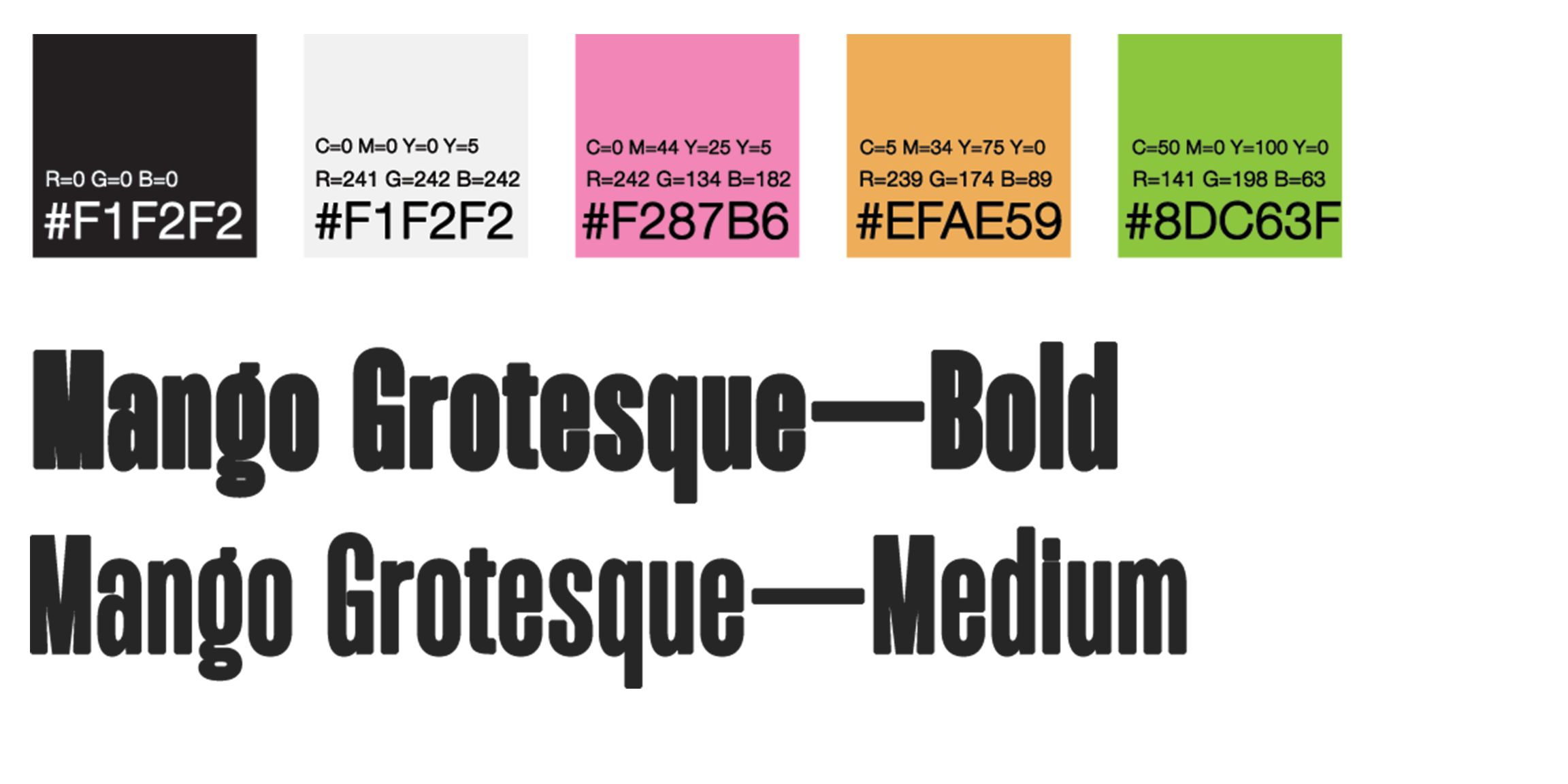
I wanted to create harmony in the background colors by choosing a secondary triadic scheme. I settled on Mango Grotesque as my typeface as it had the perfect blend of personality and legibility that especially fit the playful and humorous energy I sought to achieve.
Final Triptych
In the final versions, I tidied up the white highlights and reorganized the supplementary stats. I wanted to use the white to guide the viewer’s eye from the headline through the primary graphic models. I wanted to create a tone emblematic of the end-of-year recaps that many apps feature today.
