

Lyric Poster & Carousel
The Task:
With this project I was assigned to create a logotype based off of a song or poem, and then create a lyric poster using that logotype, and afterwards, to translate that poster into an Instagram carousel. I chose "The Dress" by Dijon as my song, as it is one of my all time favorites. It is a romantic ballad about yearning for a past relationship and an attempted rekindling that feels so sweet and soulful. I attempted to capture that nostalgia and chase of a lost spark throughout my solutions.
Early Sketches
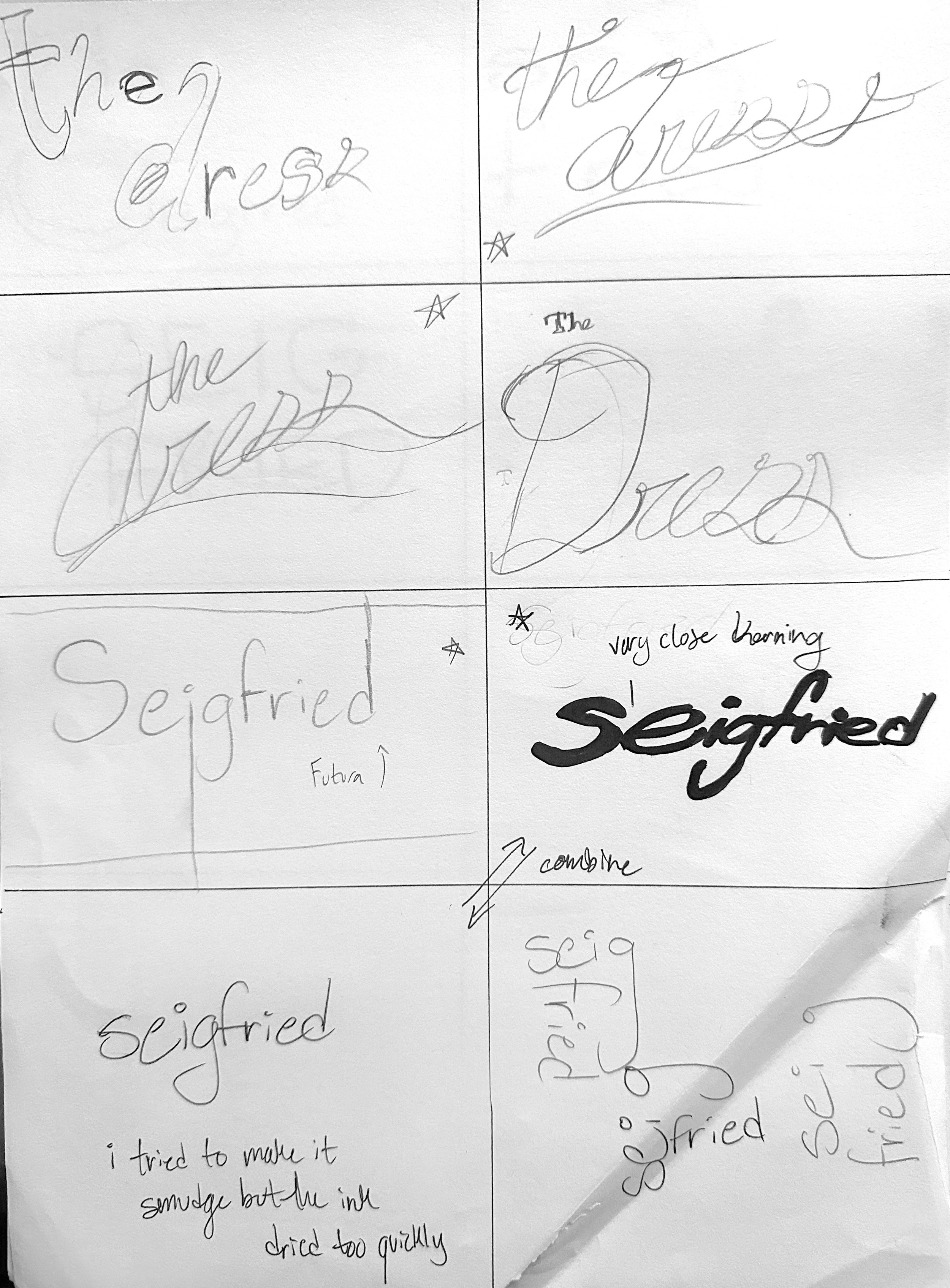
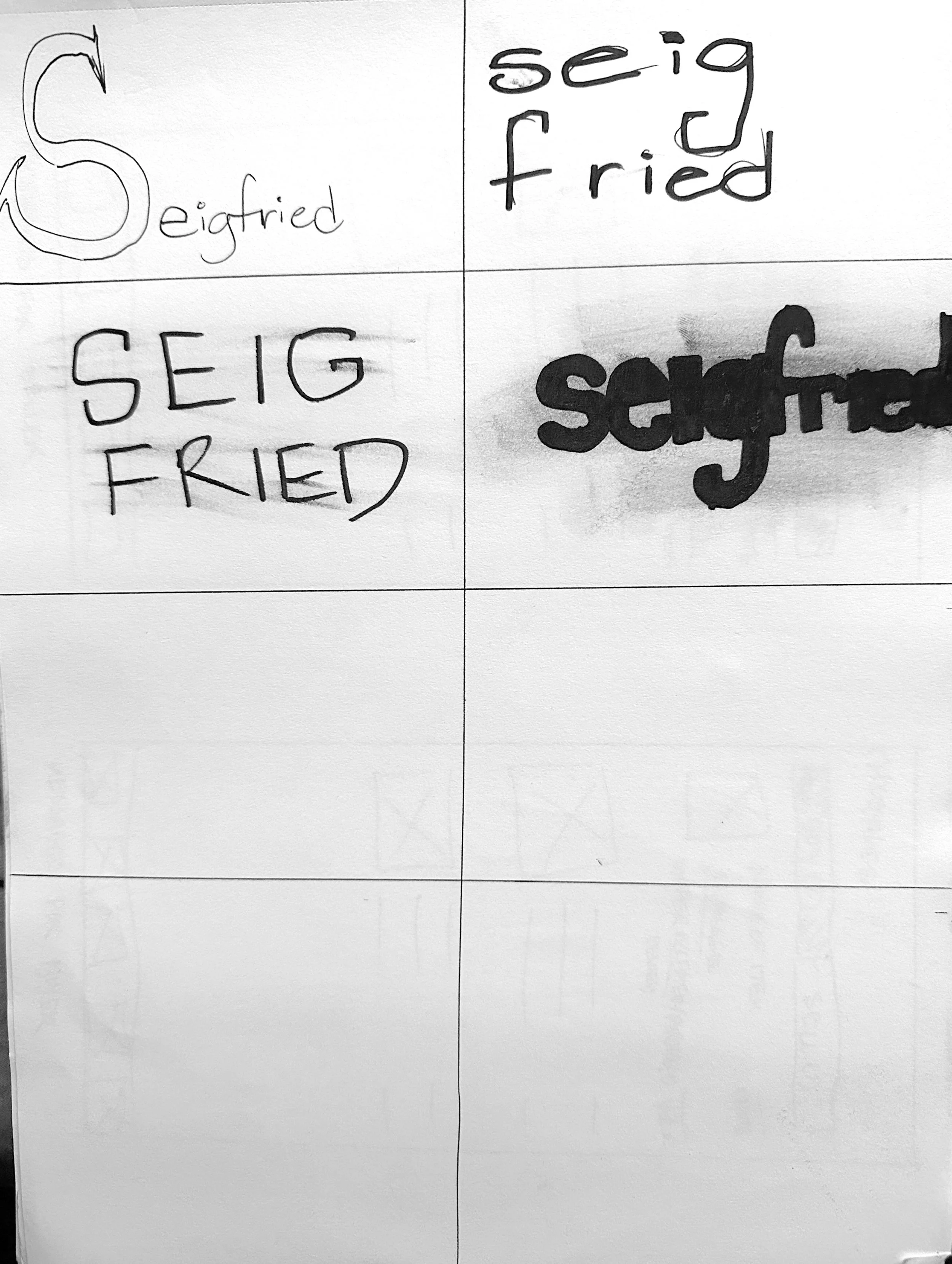
Initially, I was torn between two songs. "The Dress" was one, and the other was "Seigfried" by Frank Ocean. Both songs are some of my favorites ever, but they are drastically different tonally and thematically. Where "The Dress" feels utterly romantic and full of reminiscing, "Seigfried" is about the fear of never taking risks and living your life safely and contently. Going off of that, I imagined a very sterile and lifeless logotype to reflect the hollow feeling the song emanates. Ultimately, I decided to go with "The Dress" to put me in a better mood for the duration of the project, but I would like to revisit this idea using "Seigfried" in the future.
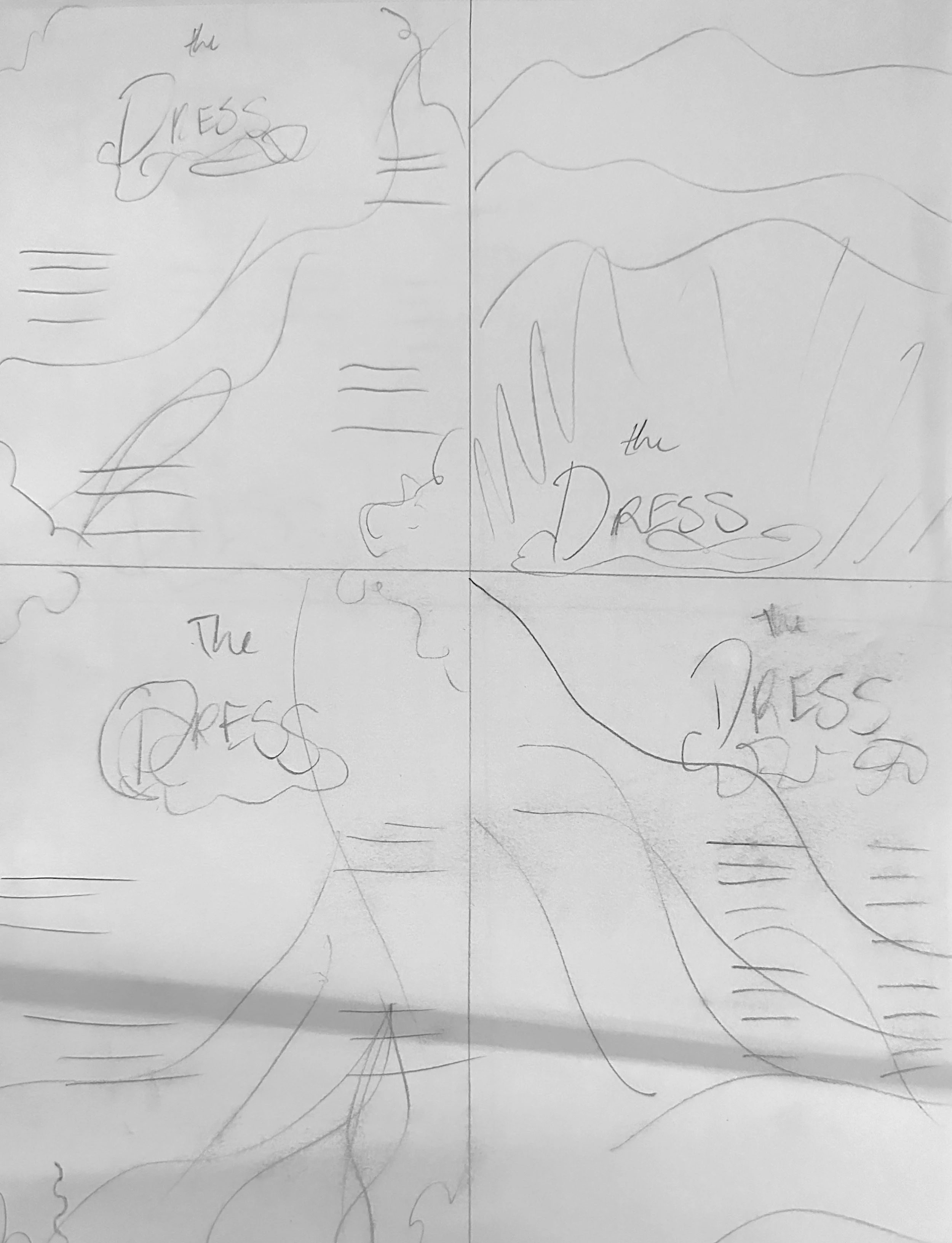
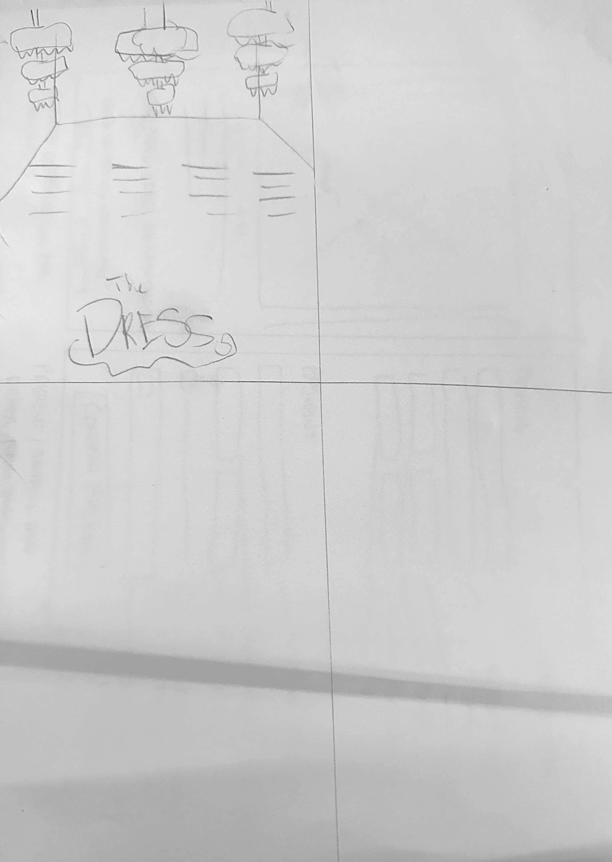
For the poster sketches, I wanted the imagery of a flowing dress, and for the folds of cloth to act as motion to guide the viewer's eyes through the composition. I also considered having a ballroom act as a background, as the lyrics include mention of dancing throughout. Really, I just wanted a general sense of where I wanted to place information.
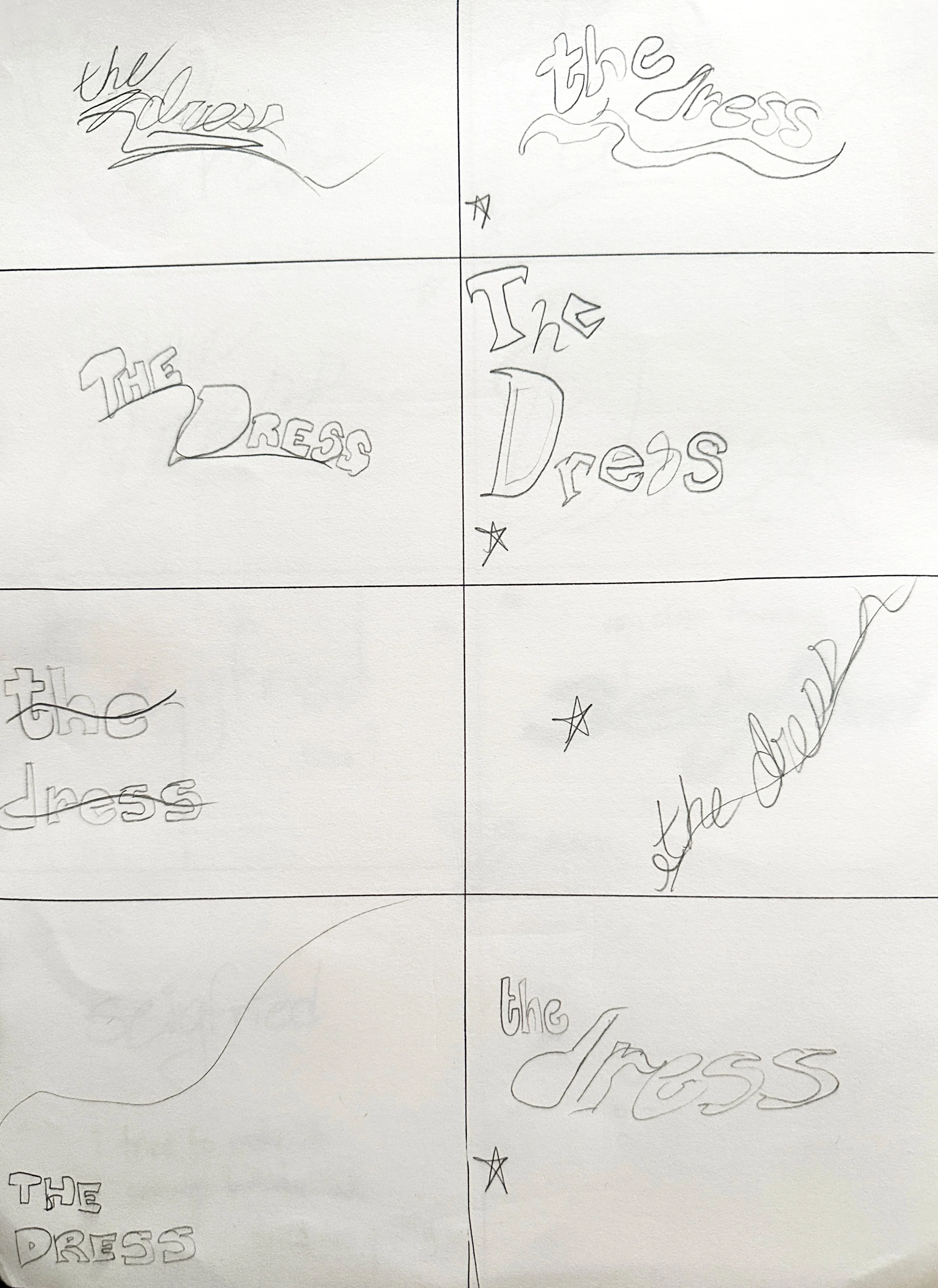
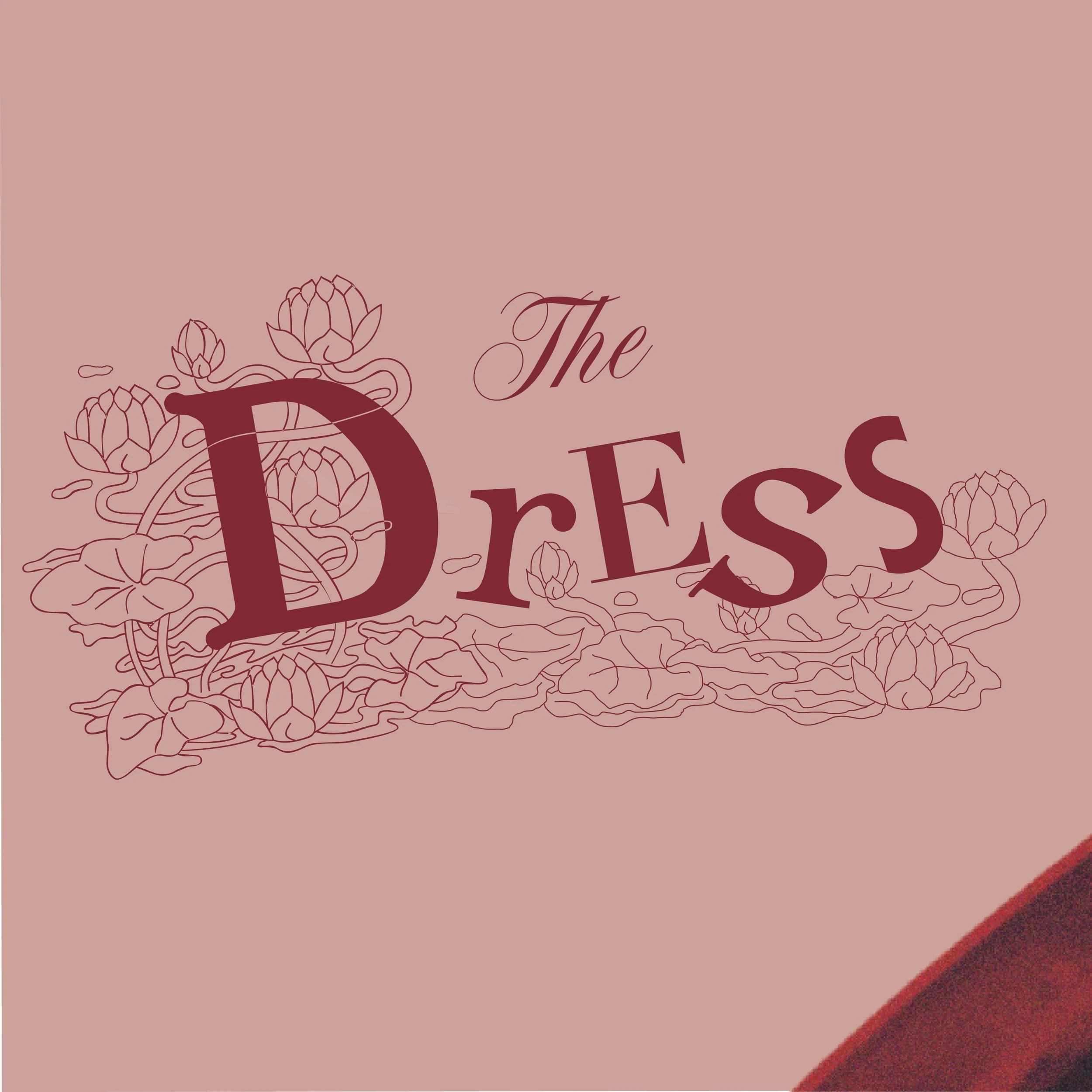
Logotype Tests
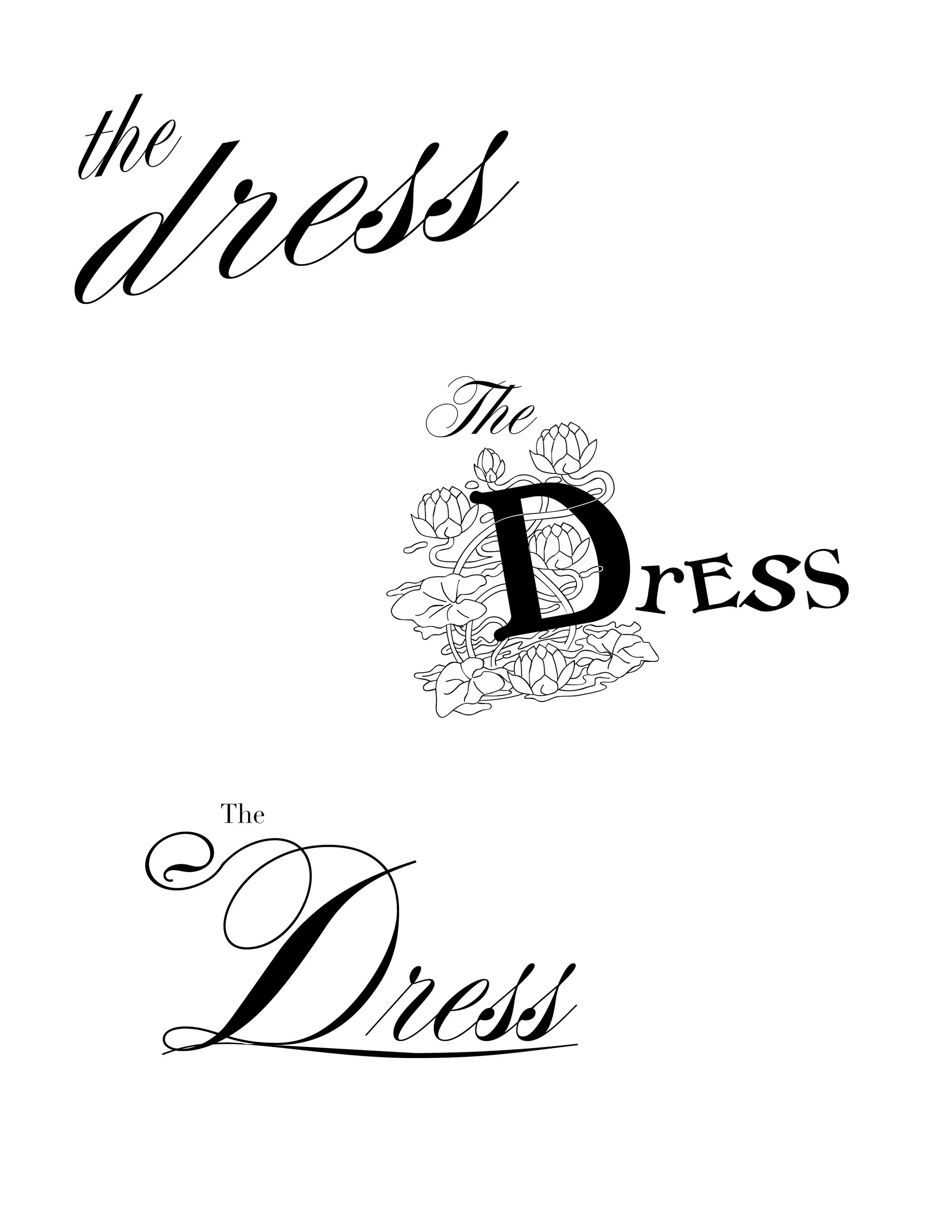
With the logotype, I initially wanted to find something elegant, like a cursive script font I used in the top and bottom drafts. However, I much preferred the middle draft. I imagined the different fonts for each letter not so much as a ransom note, but as representative of different memories or time periods of a relationship and your time with a partner. One of Dijon's tour posters also includes a similar hodgepodge of letters, which served to further my inspiration.
Poster Drafts
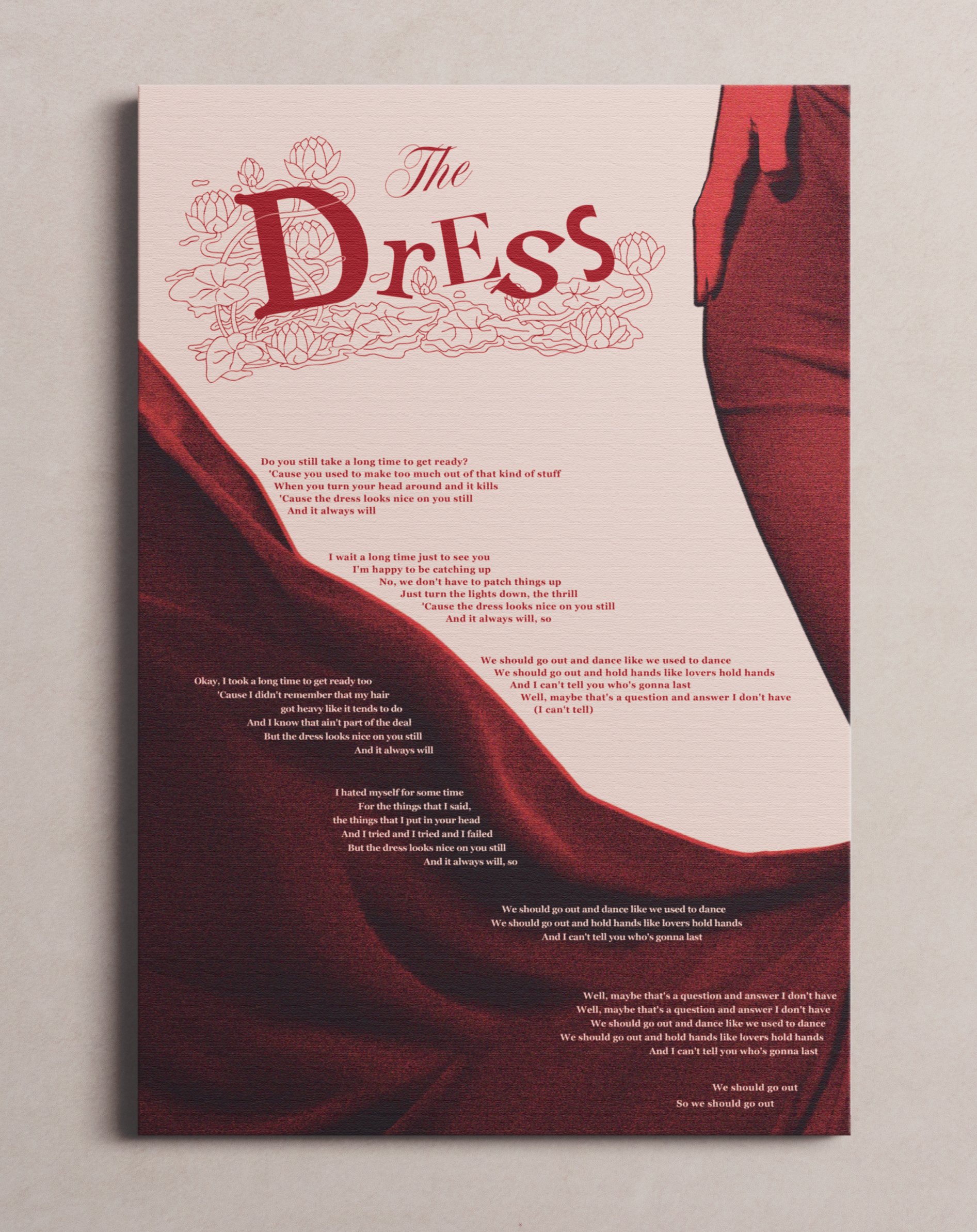
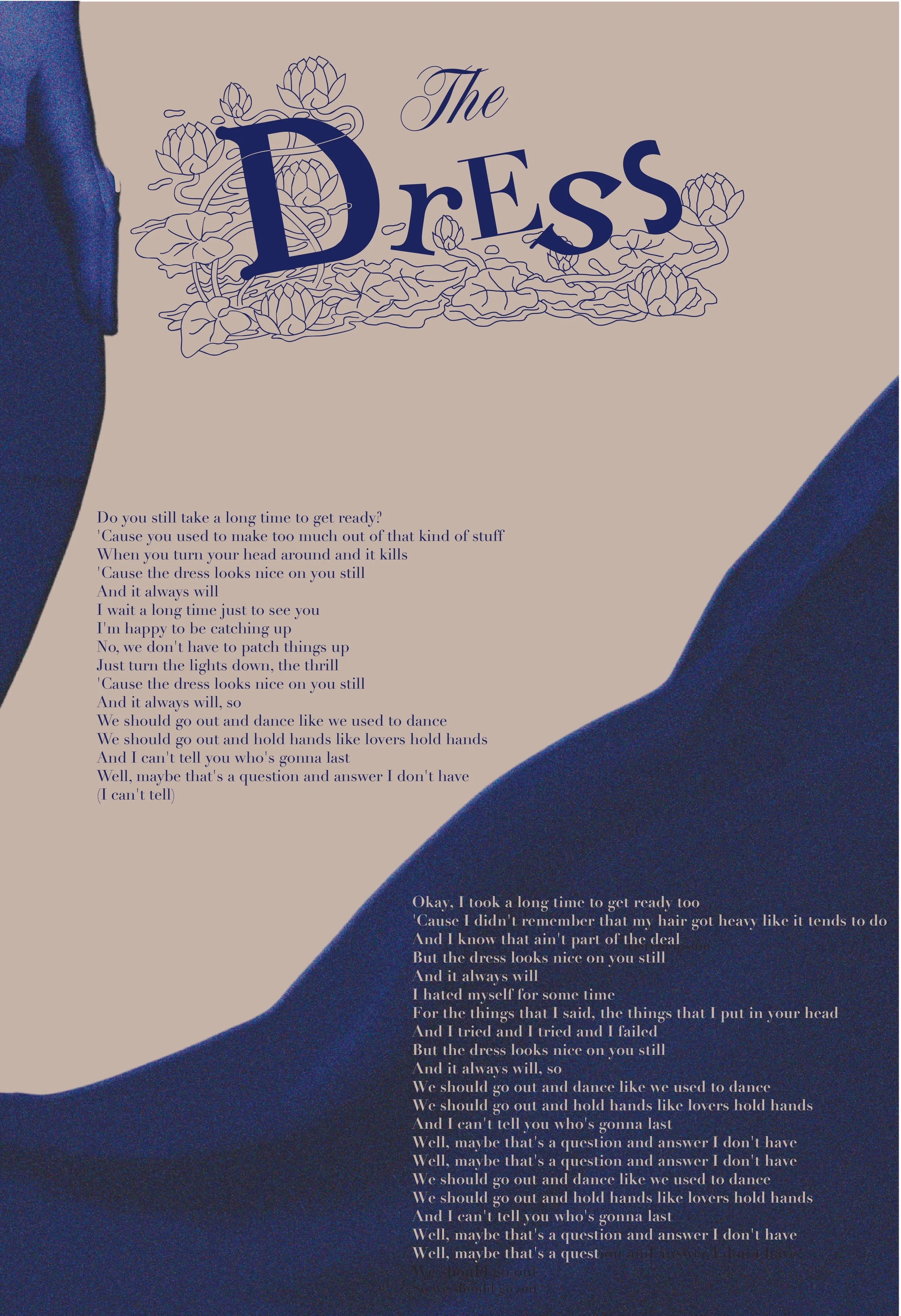
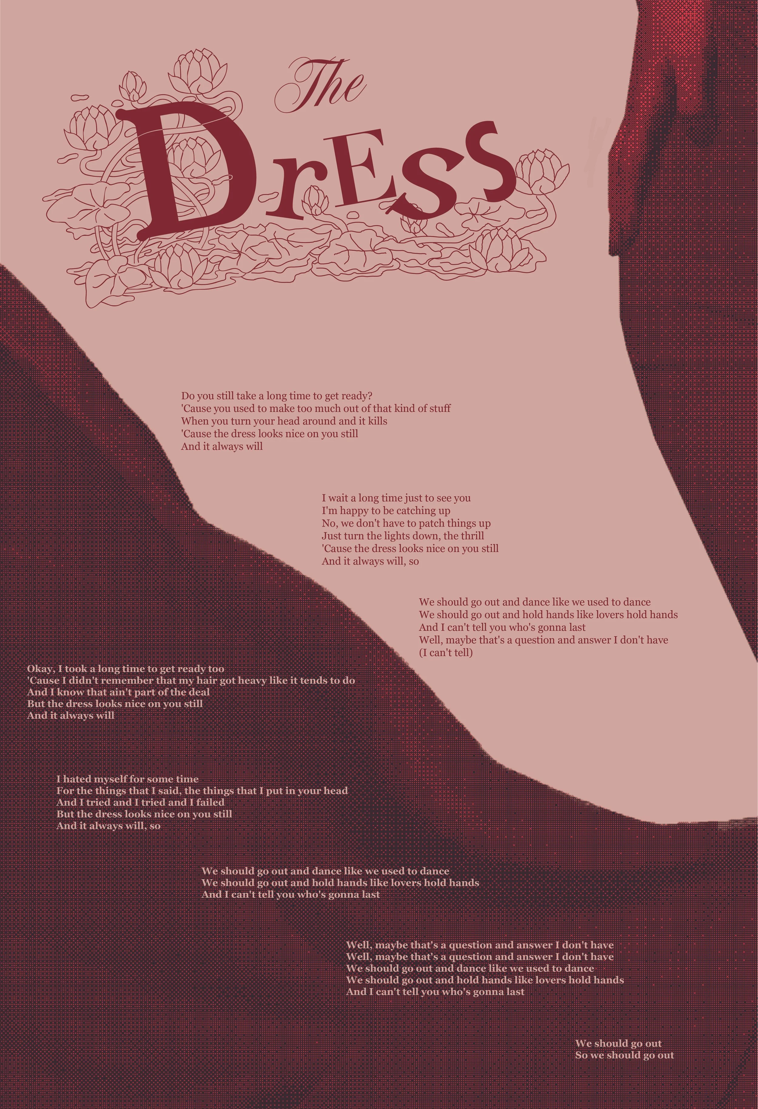
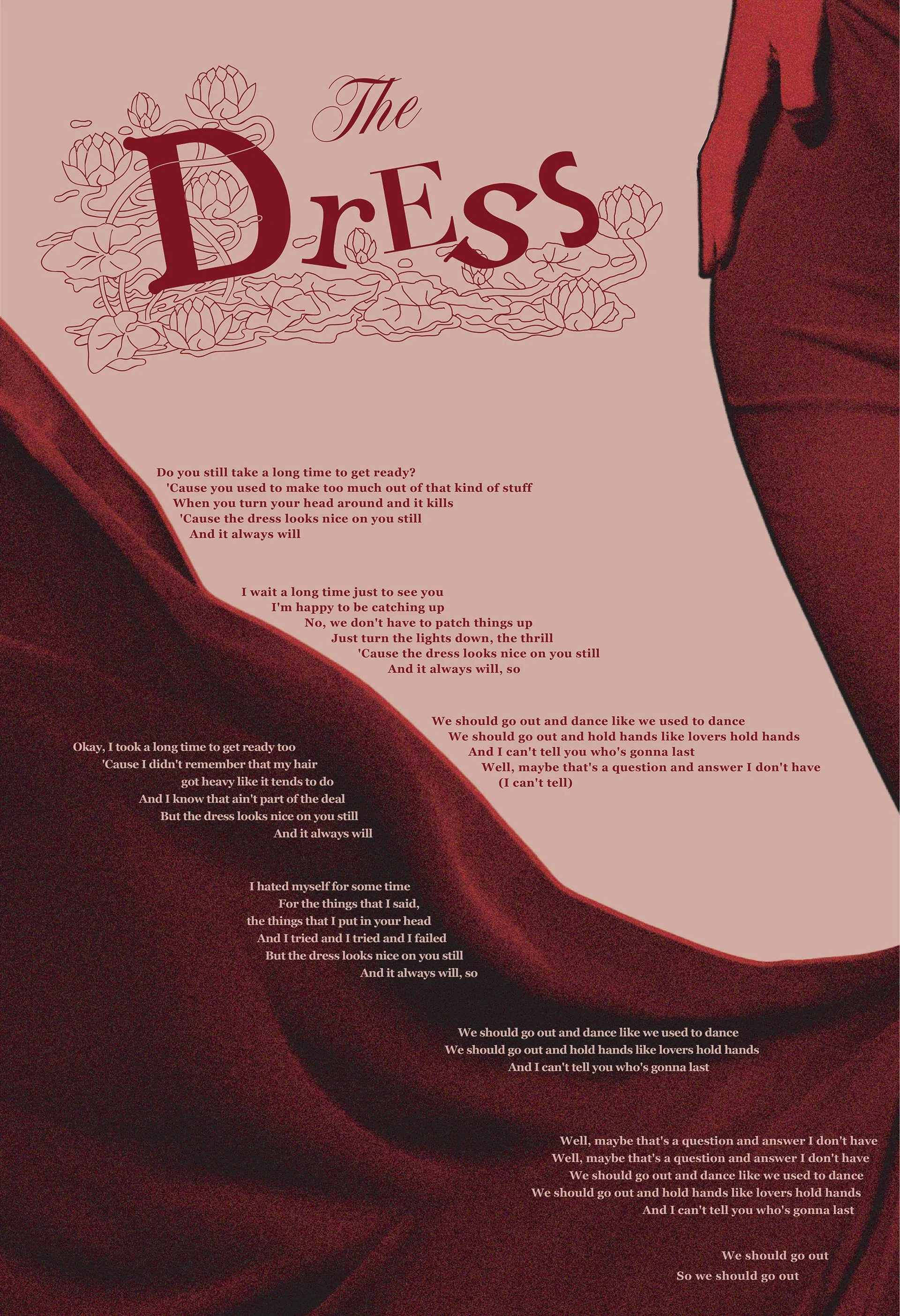
In the poster drafts, I ultimately decided on the idea of a flowing dress being the loud, and primary focal point. I wanted the figure to be incredibly large, but with only a slight part of their hand in frame, as if they were leaving, or re-entering depending on how you interpret it. I experimented with multiple palettes, and through peer consensus, the maroon red was the most compelling—and romantic.
Font & Color Palette
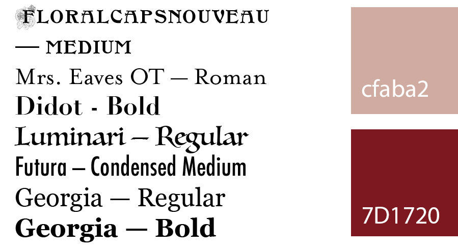
I used multiple different typefaces to create the logotype, with FloralCapsNouveau being the star of the show. I love the decorative floral elements of the typeface, and illustrated them throughout the rest of the logotype. I decided on Georgia for the body text, as I wanted a serif that felt more welcoming and lively than formal.
For the palette, I went with a maroon red, and a faded pink background to truly enhance the romanticism of the composition.
Final poster & Carousel
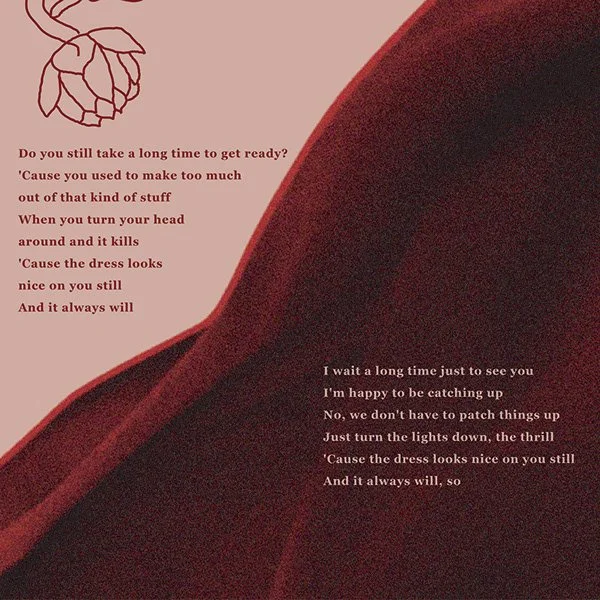
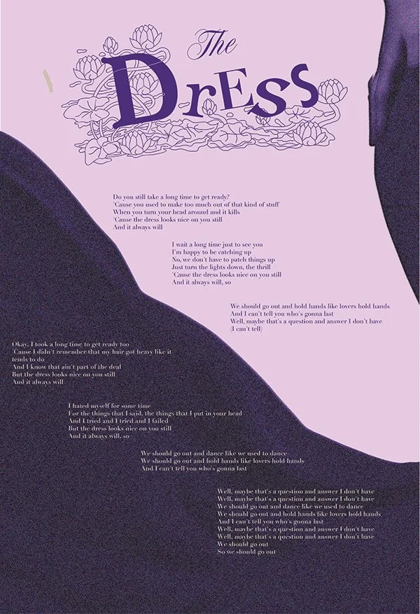
For the Instagram carousel, I shortened the amount of lyrics to just the beginning and chorus to not create too much visual clutter. I considered just rotating the dress, but I felt that the flowing fabric was a better way to connect the three frames. I also included more enlarged floral elements for decoration.
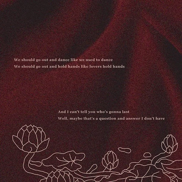
For the final poster, I adjusted the positioning of the letters to exaggerate the concept. I also adjusted the lyrics to fit the curves of the dress, and better accentuate the path down the poster. I went for a noisy image treatment on the dress. I wanted to give it the look that it was a photo taken on film to accentuate the idea that this is a fleeting and perhaps rose-tinted memory.