UI of the Week:
Create a unique mobile user interface every week, incorporating new features each week.

We built our first UIs together in class, which were for a sign up/log in screen. Although the theme did not have to be unified, many of us decided to create one for a dating app. Here I was still getting familiar with Figma and all of its features, and I went for a simple, flat interface.
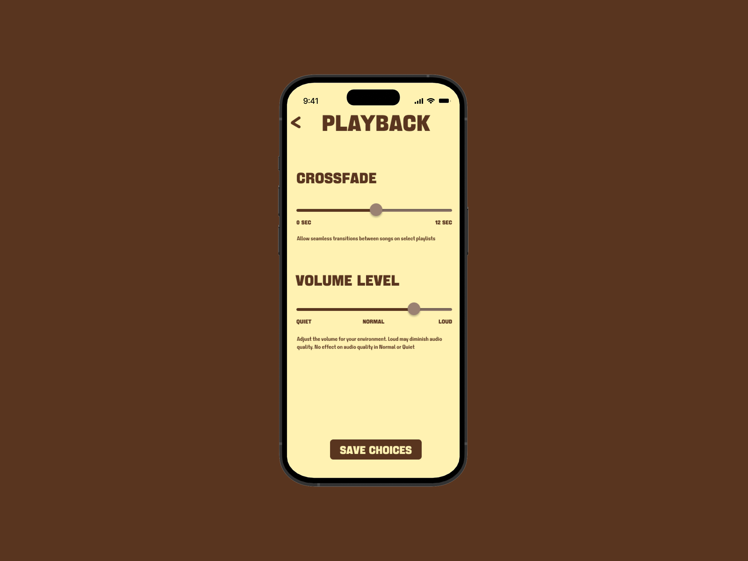
By the second week, we began to make UIs on our own. The immediate idea of an interface with buttons and sliders that came to me had to do with volume. Here, I decided to play with color and typography in a way that still worked in a UI context. It was a challenge I sought to replicate throughout the rest of my interfaces.
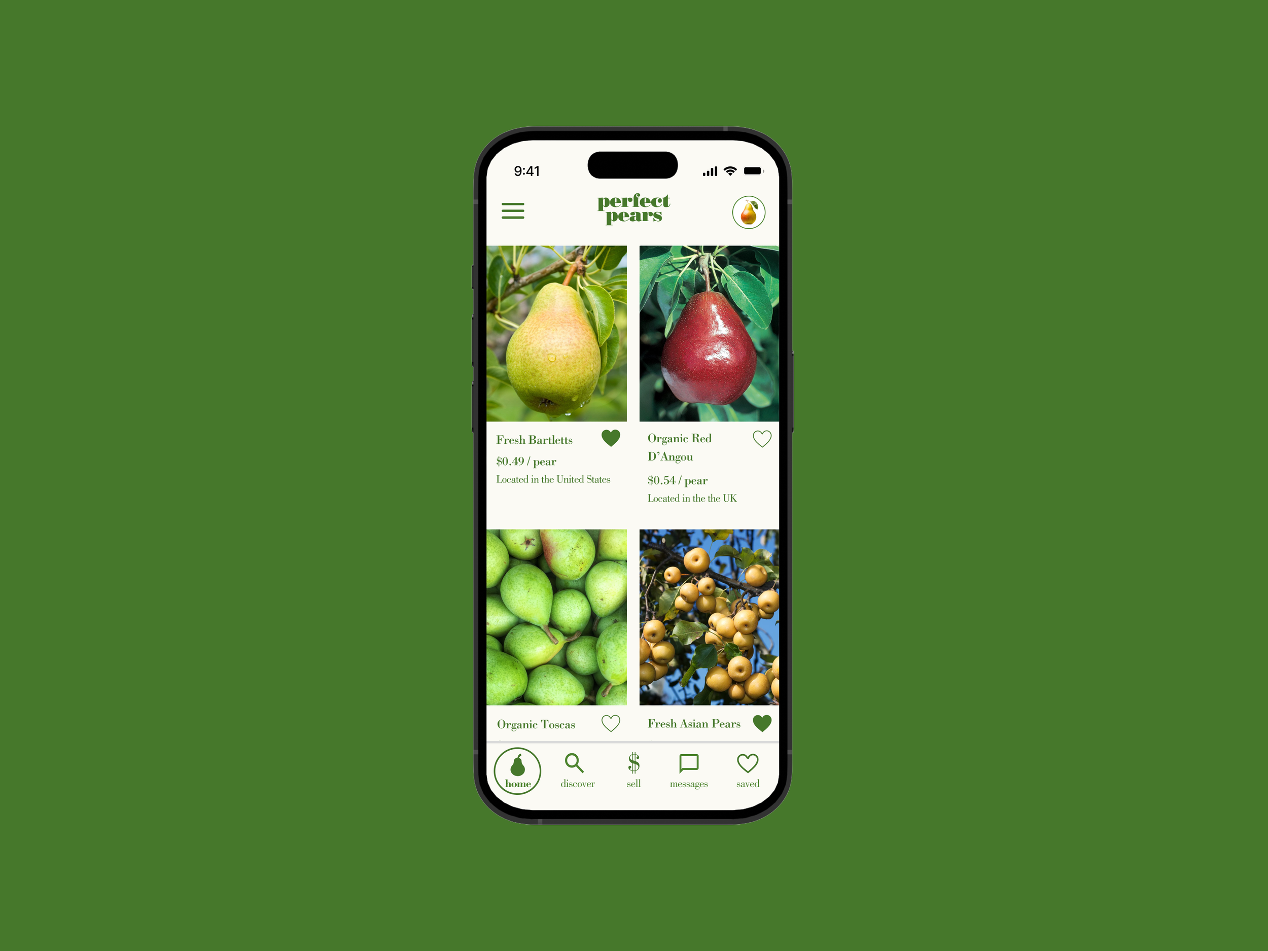
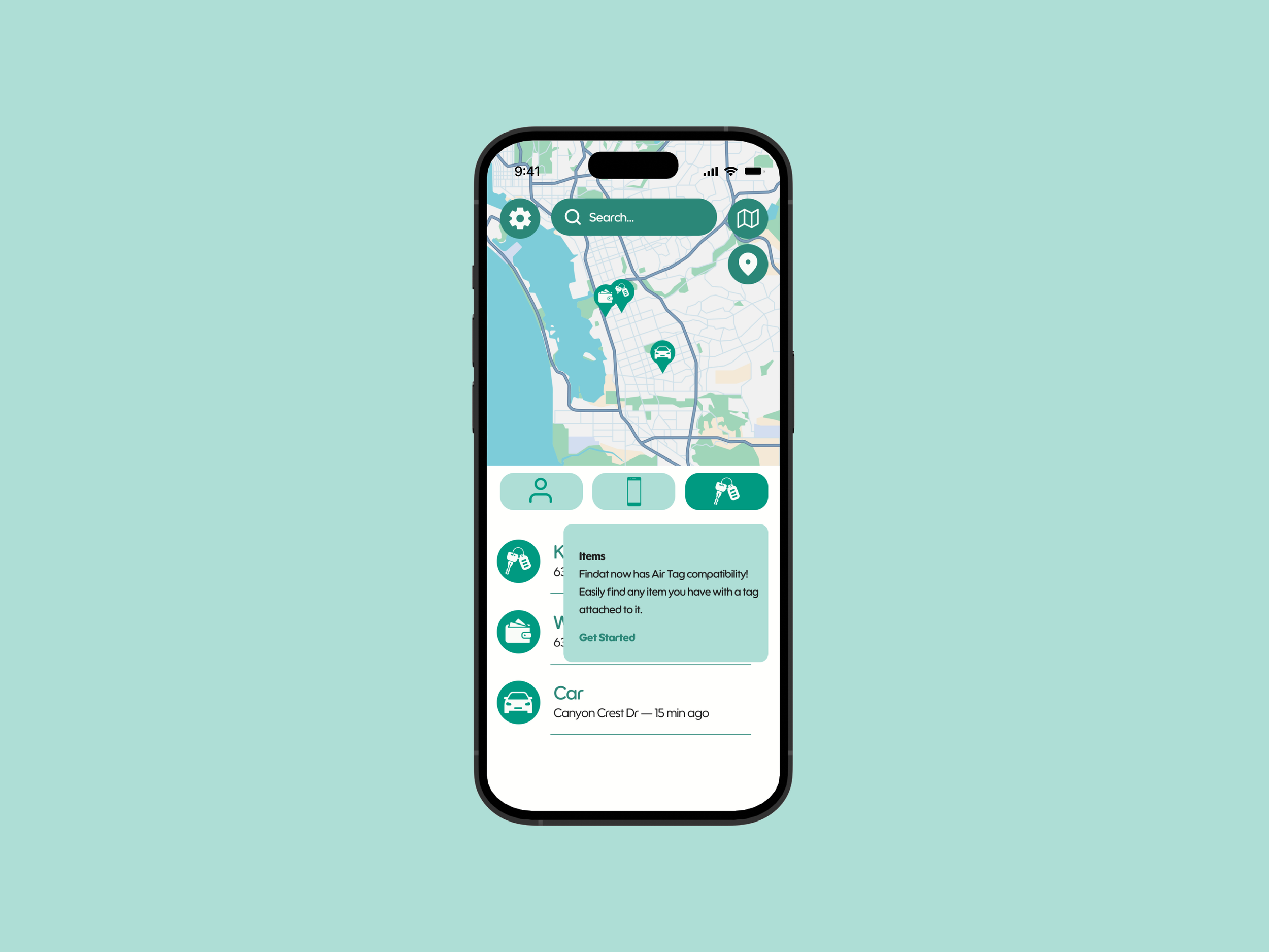
Inspired by the layouts of online shopping apps I use, I started to dive into more surreal themes while still keeping my compositions clean and legible.
Here I played with Figma’s design tools to create some custom icons while working with a softer, standard type of typography.
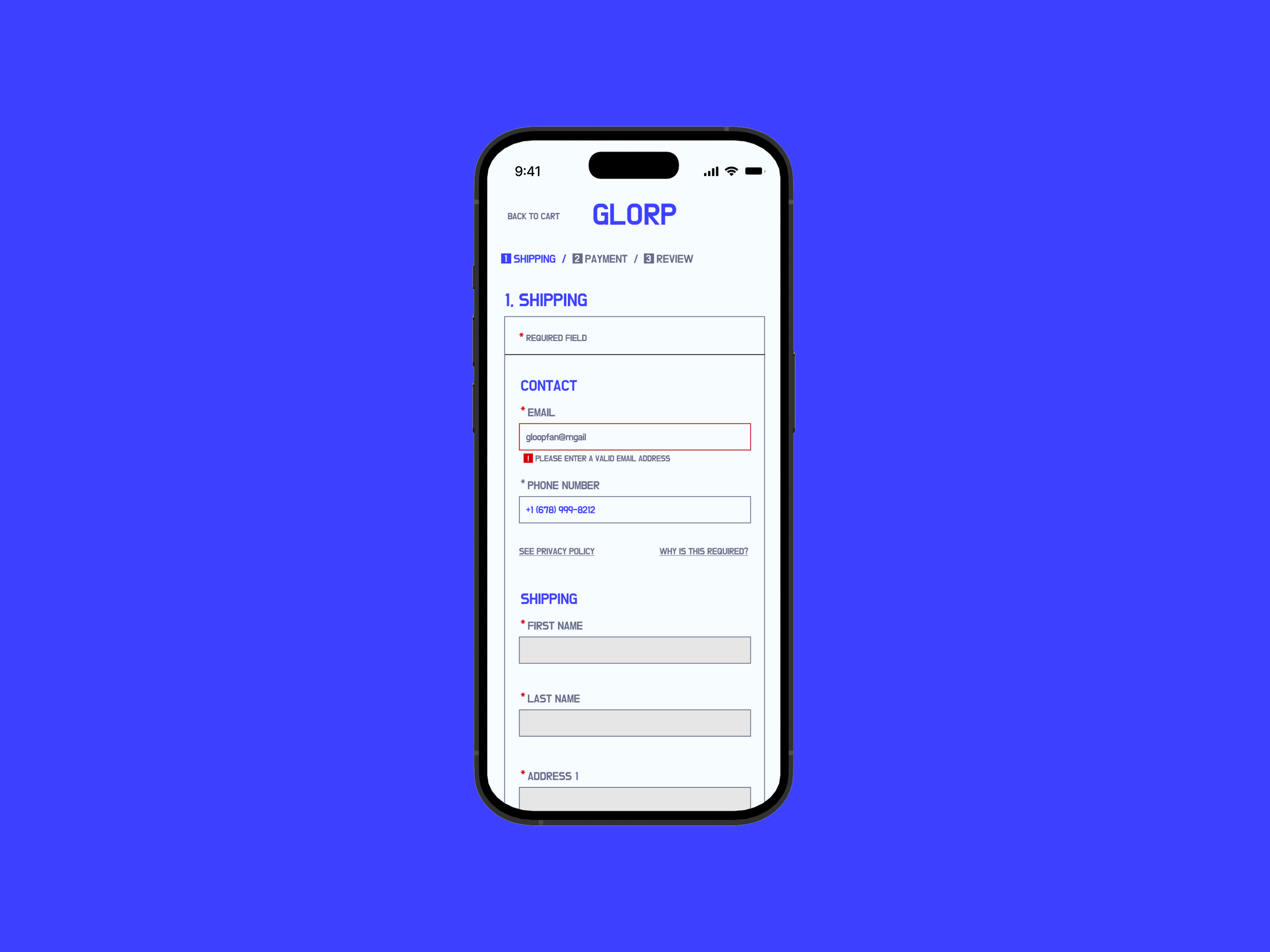
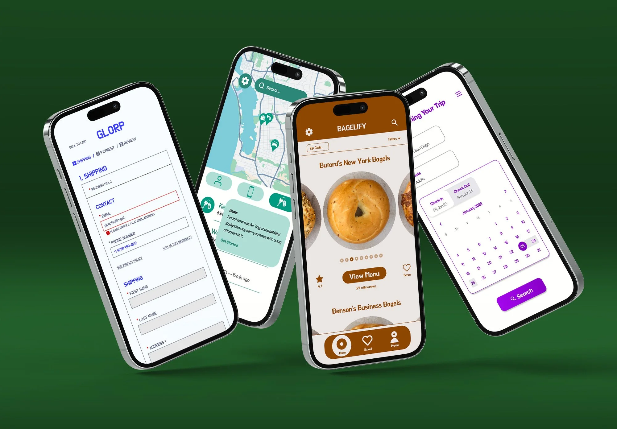
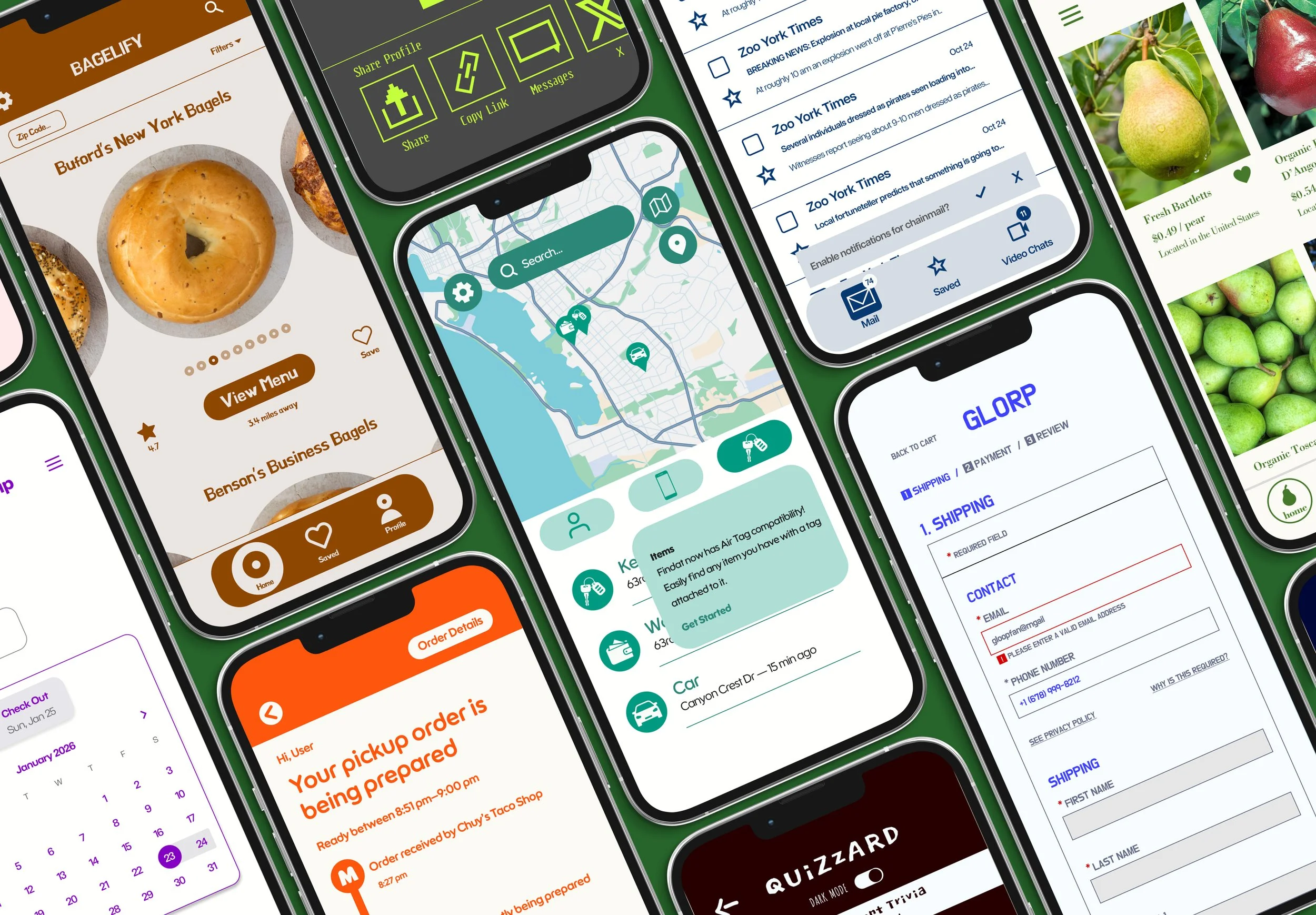
Inspired by modern, angular, high-fashion app design, I created this retail checkout tab. I wanted to indicate the different levels of hierarchy within the text fields without making it too distracting.
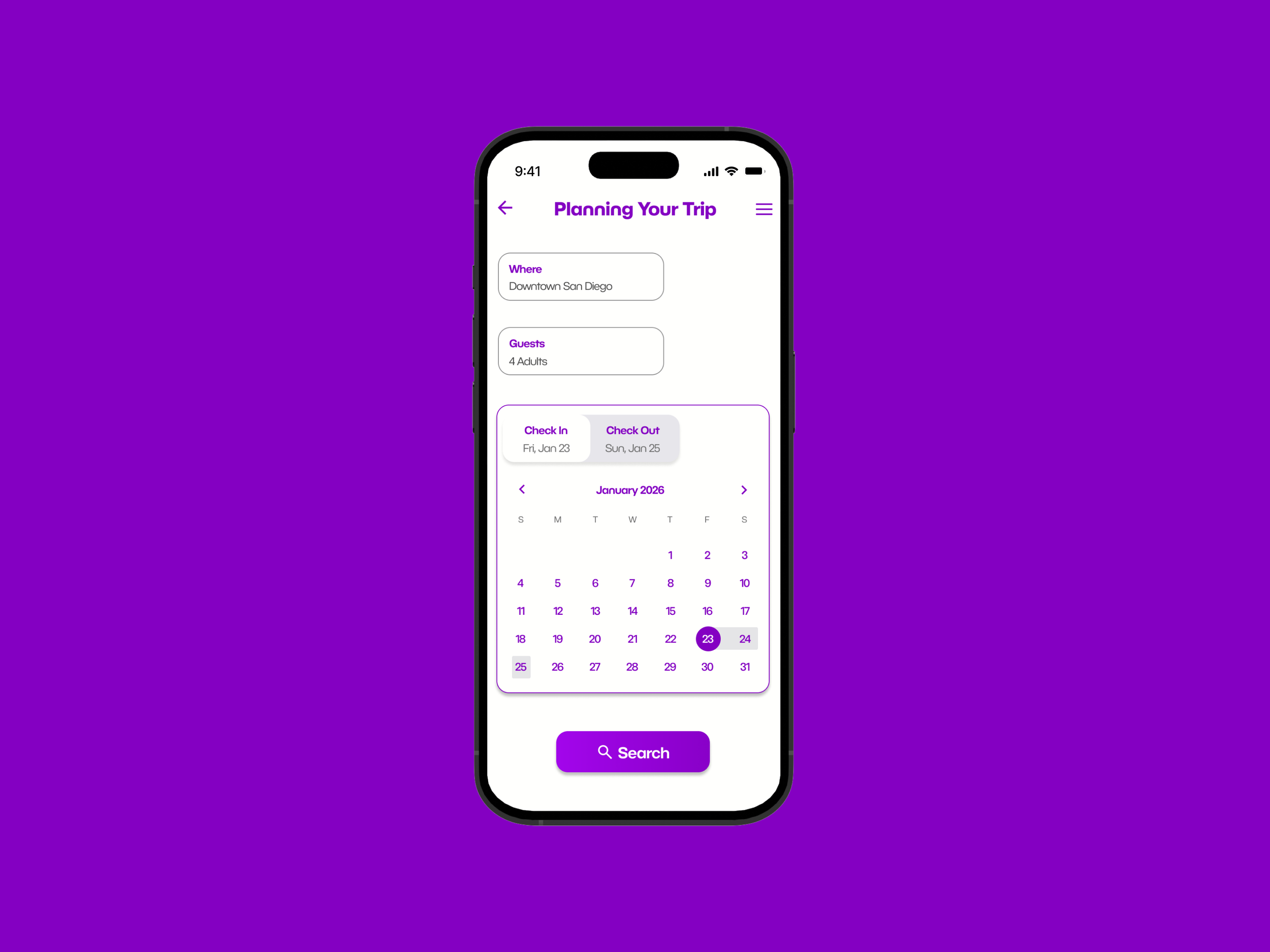
With date pickers, it is difficult and likely unnecessary to reinvent the wheel, so I wanted to make sure that my color contrast was high and my visual hierarchy was on point.
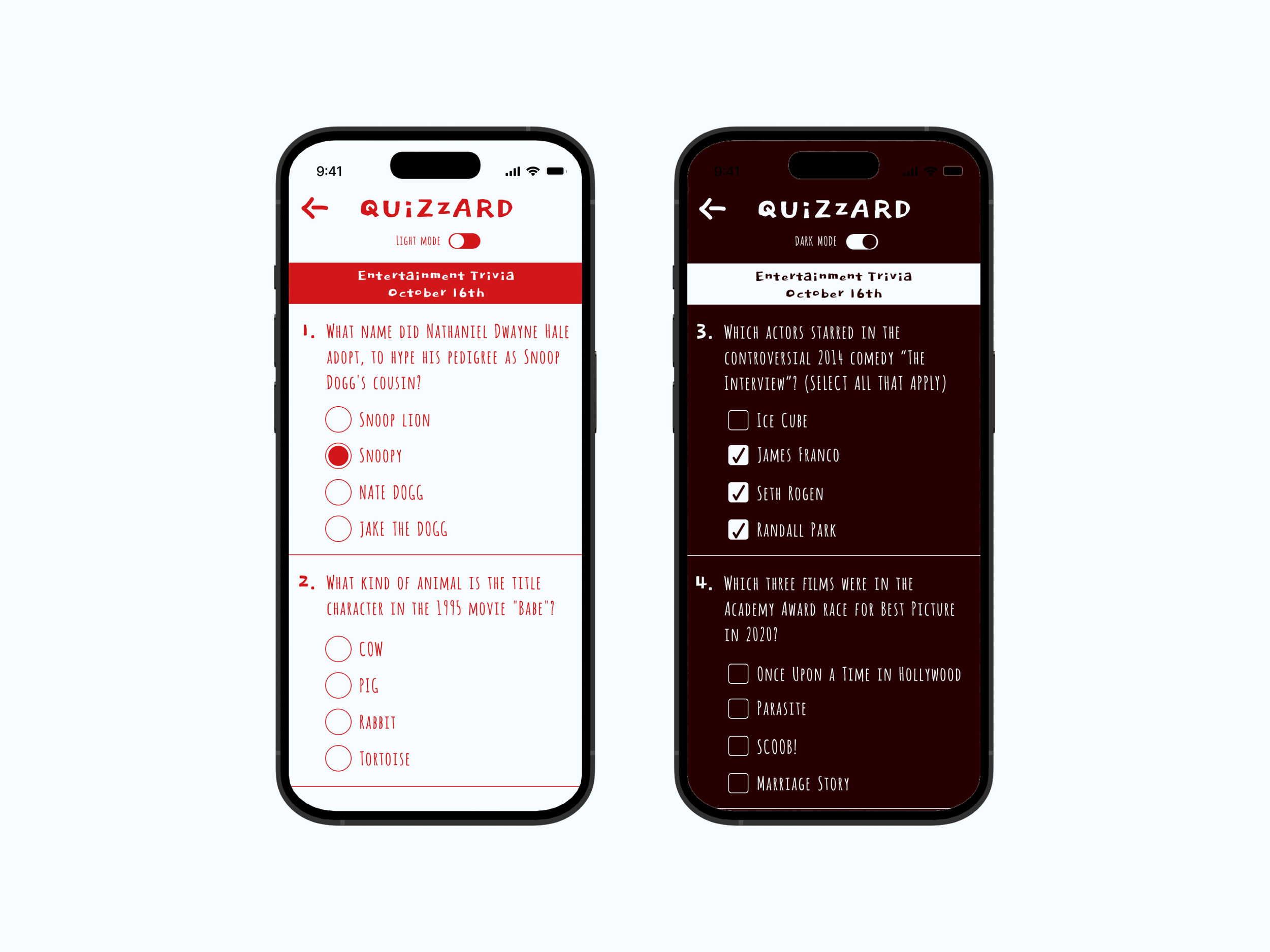
I wanted to avoid repeating the same visual language over and over. Here, I made one of the more radical departures from the norm with handwritten typography that was more prevalent in early 2010s mobile UI.
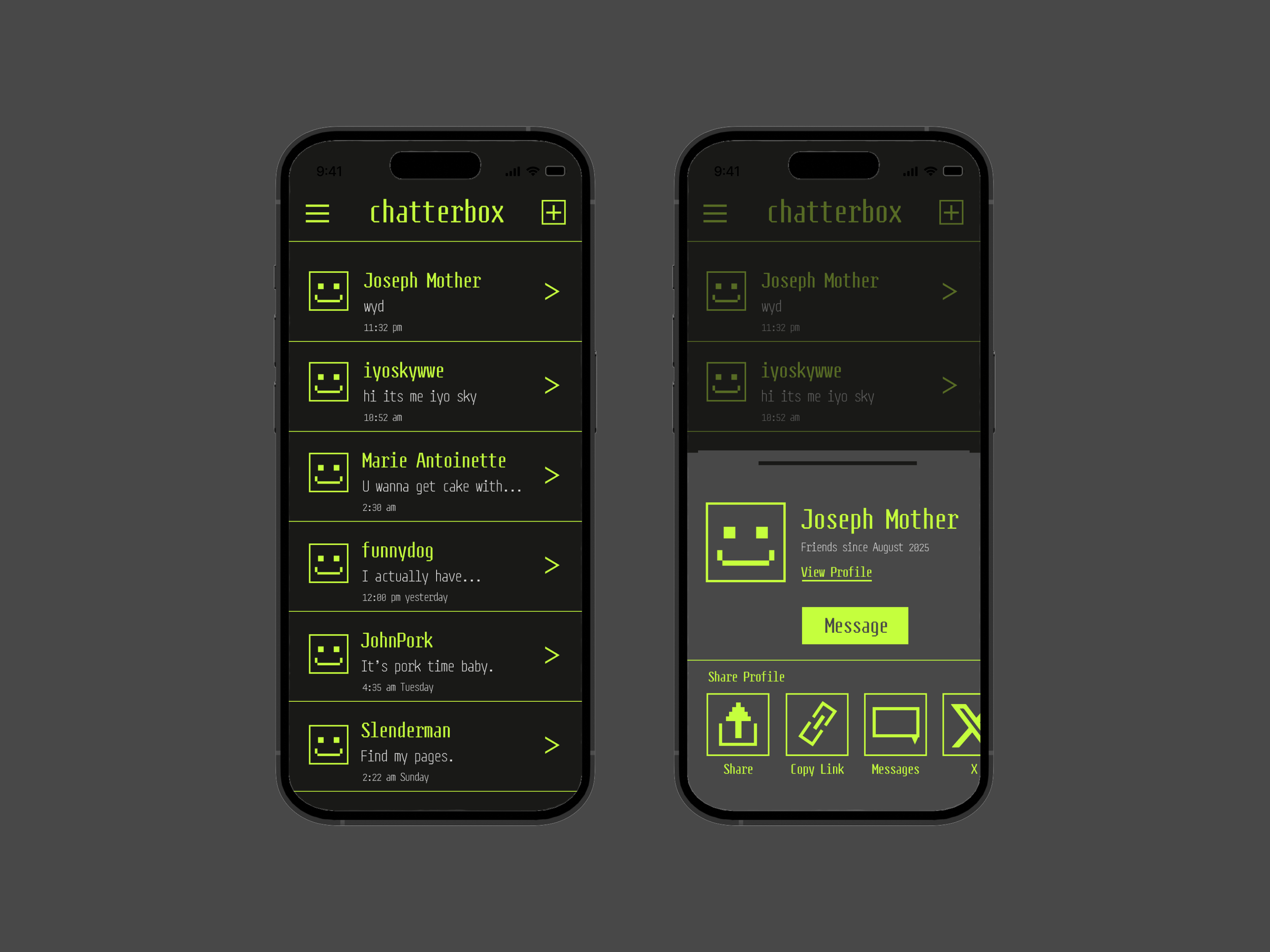
In my other steep departure from design norms, I made an ode to retro bitmapped digital design with this messaging interface.
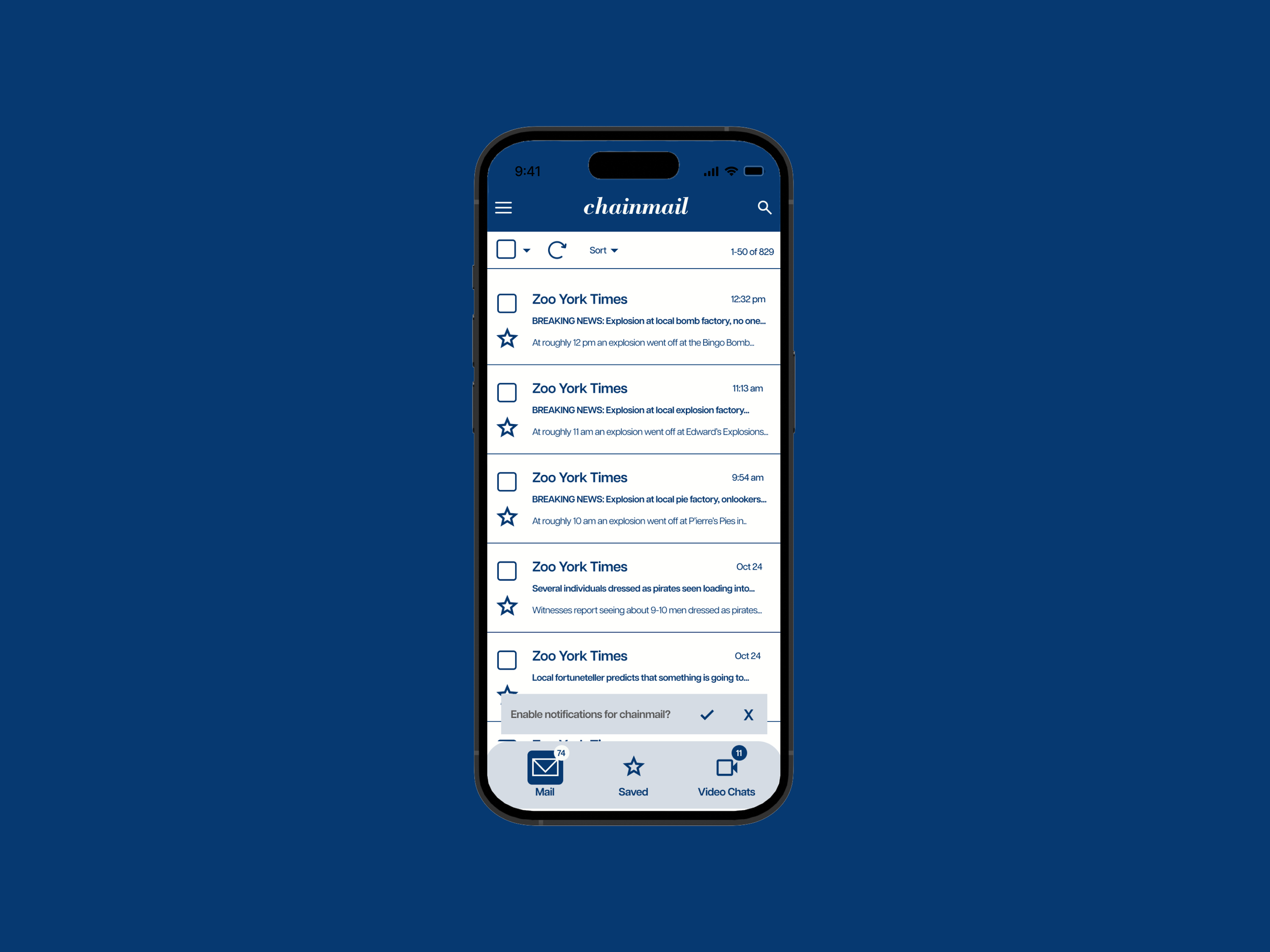
A return to more traditional UI practices. I also challenged myself to create interfaces for all kinds of apps; here I covered email. At this point, the first step in my design process was deciding on typefaces for the header and body copy. The typography then informs the rest of my design, from scale to even color. I felt that navy blue and a bright white suited the professional look of the serif-sans serif combo.
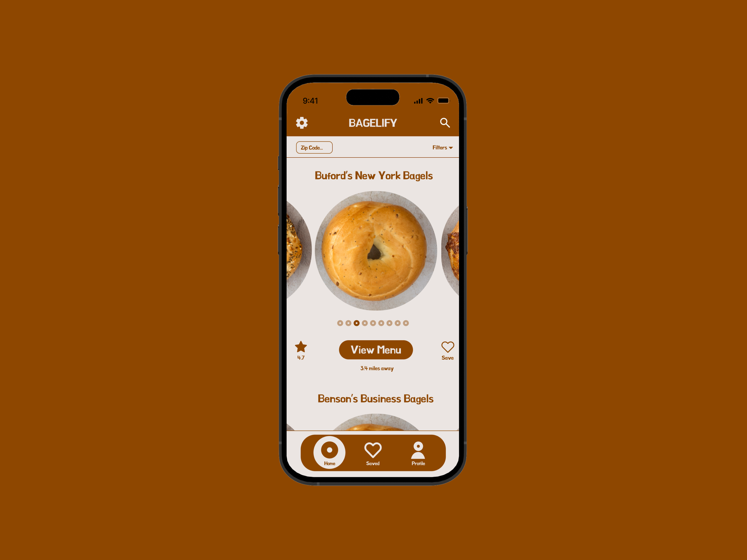
This and Week 5’s Text Field UI may be my favorites. I feel that in these, I found the best balance between tradition and personality. I particularly enjoyed implementing the circular elements throughout the interface to really tie in the bagel theme.
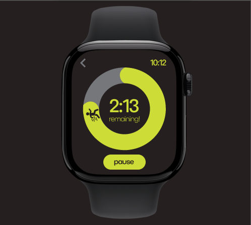
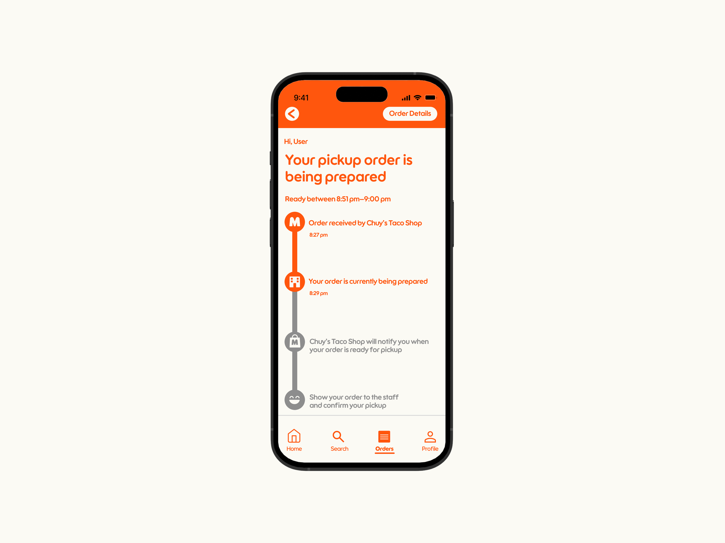
Here, we were specifically tasked with designing for a smartwatch format. Working within the limited space was challenging, but ultimately, I am satisfied with the interface. Were this an animated interface, the little icon would start stationary before running the course of the timer.
For the second-to-last UI, I felt the semester’s worth of routine come into play, as the arrangement of type, color, and image all felt natural and free-flowing.
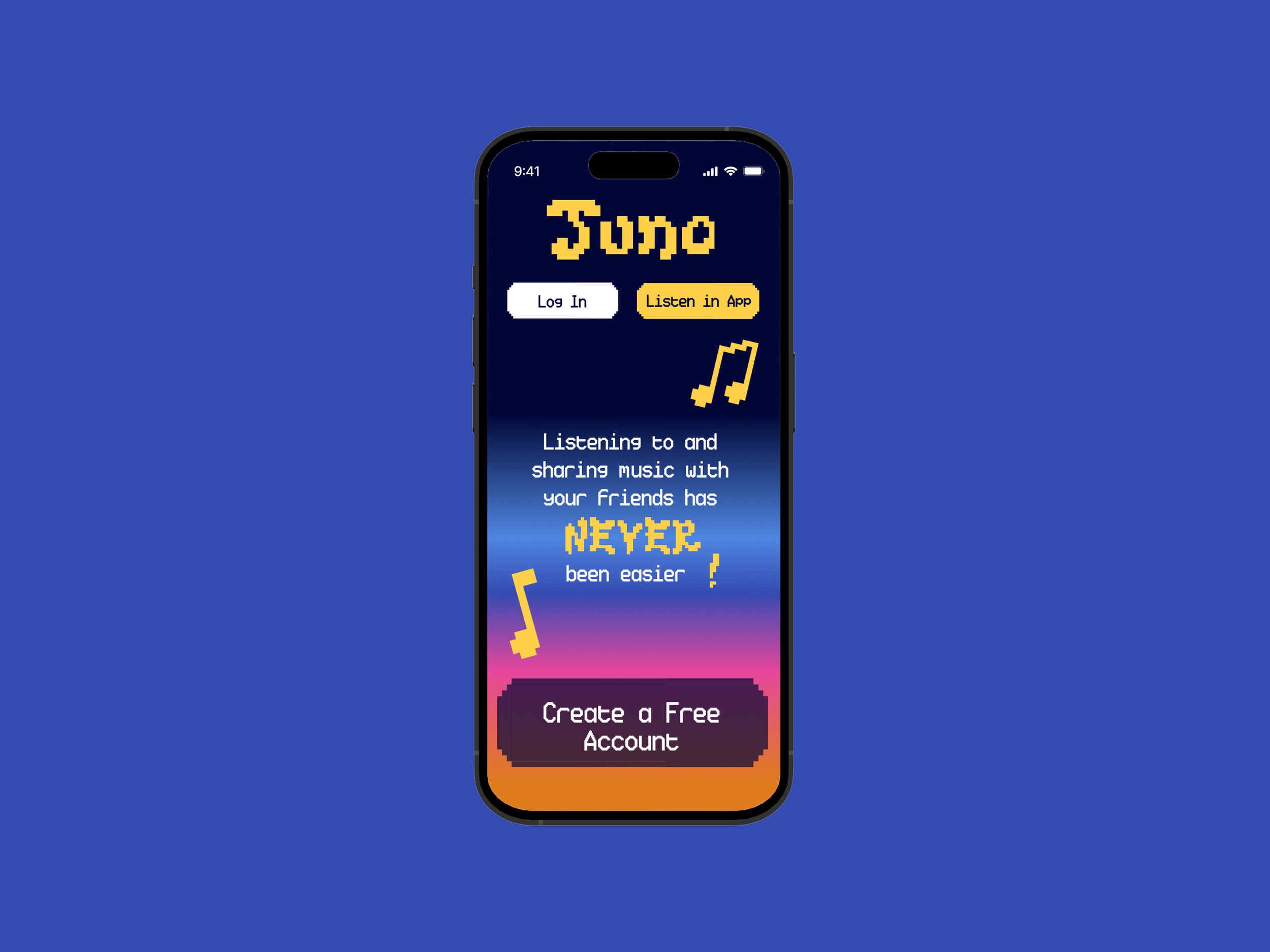
The final UI was directly connect to the primary class project. In my case, it was for my partner and I’s music streaming app. This was my take on a mobile and desktop landing page. Our design system was a very opinionated, bold, and colorful one, and I implemented our elements from it to provide a window into the larger app.
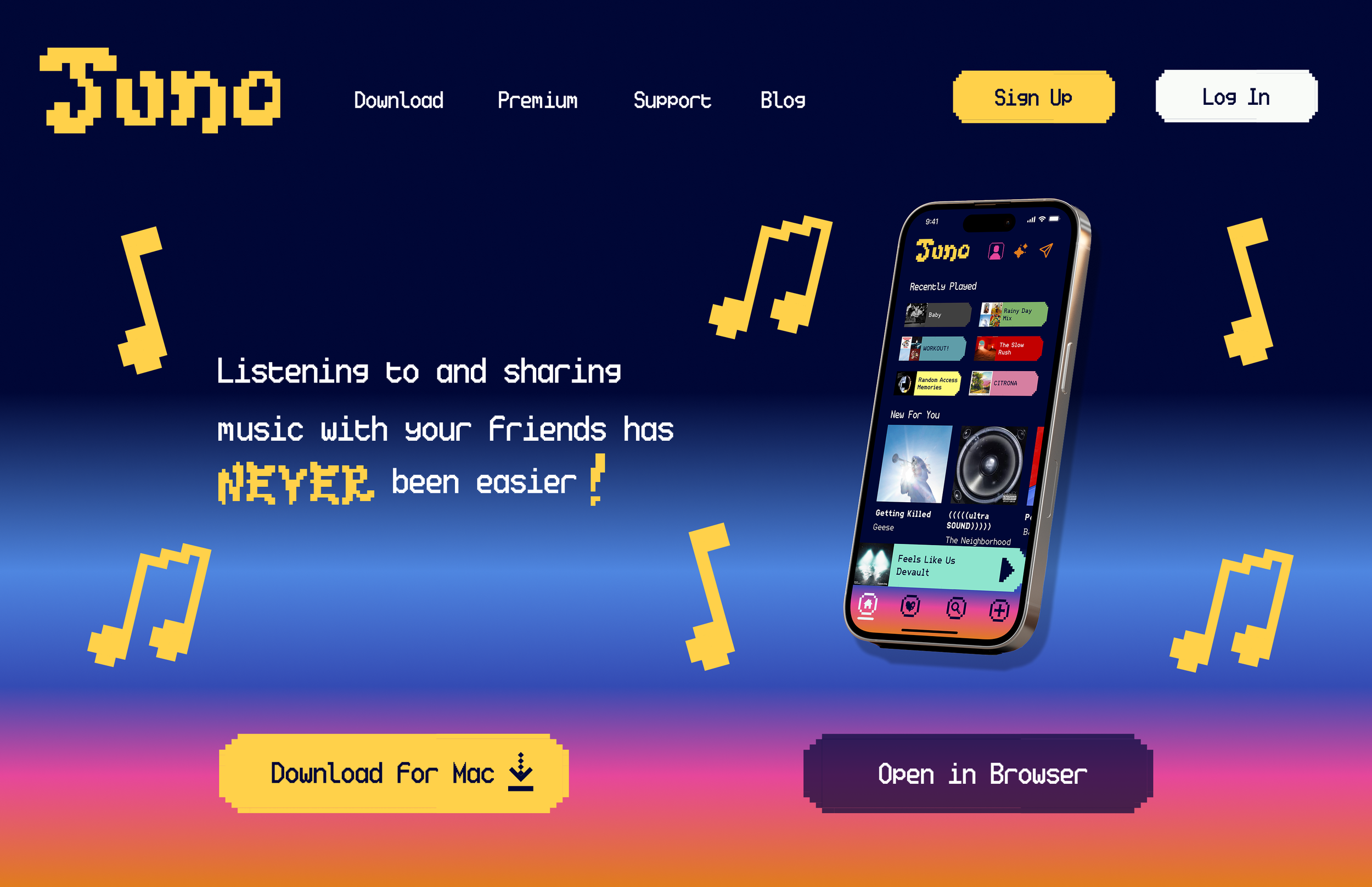
The final UI was directly connect to the primary class project. In my case, it was for my partner and I’s music streaming app. This was my take on a mobile and desktop landing page. Our design system was a very opinionated, bold, and colorful one, and I implemented our elements from it to provide a window into the larger app.